Skip to content
← All work Brand identity · Suggaa — The Honest Taxi

Brandguidelines.

The complete identity system I designed for Suggaa, a city cab brand — logo, construction, colour, typography, icons, illustration, the new bike cab fleet and motion. Scroll, and watch it build itself.

  • ClientSuggaa Venture
  • IndustryMobility · Cabs
  • My roleLogo, identity & guidelines
  • EditionJanuary 2023

“Our Saathi drivers, always ready with a smile and a “Jai Ho” to make our day Bright-O.”

01

A friendly parrot

The symbol is a parrot — colourful, chatty and impossible to miss, just like a cab ride with a good Saathi should feel.

02

Honest & simple

A clean geometric wordmark in Suggaa charcoal, a single brand green and lots of white space. Nothing to hide.

03

Built from one letter

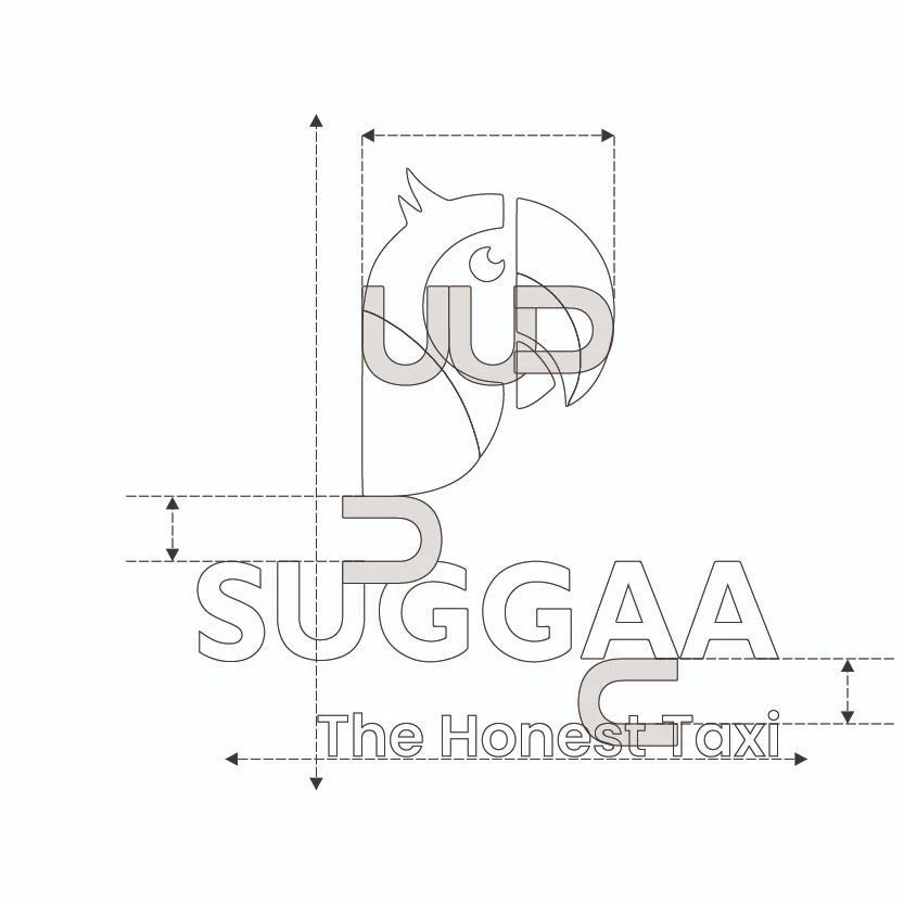
The whole logo is measured in “U” — the letter from the wordmark sets every gap, margin and offset.

02 · Construction & spacing

Everything is measured in “U”

The letter U from the wordmark is the unit of the whole identity. Rotate it and it draws the parrot’s head and beak. Its width is the gap between the parrot and the word. Turned on its side, it sets the space between SUGGAA and the line “The Honest Taxi”.
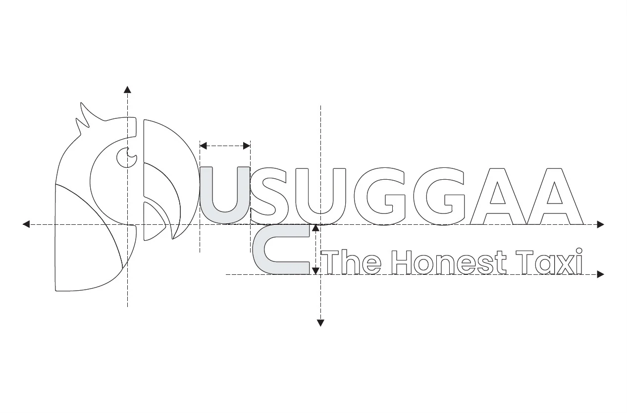
Construction drawing of the horizontal Suggaa logo with U-based spacing
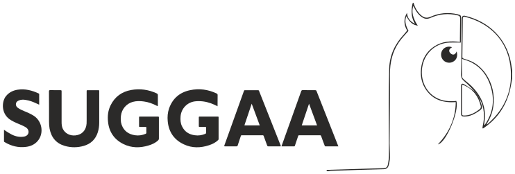
Final horizontal Suggaa logoThe Honest Taxi
ConstructionFinal logo
Construction drawing of the vertical Suggaa logo built from U shapes
The parrot’s head is built from the same U, mirrored and rotated.
  1. UGap between symbol and wordmark = one U width.
  2. ⊂Space above the tagline = one U turned on its side.
  3. ⇲Tagline aligns to the end of the wordmark.
03 · Clear space & scale

Give the parrot room to fly

Suggaa horizontal logo with clear space UUUU

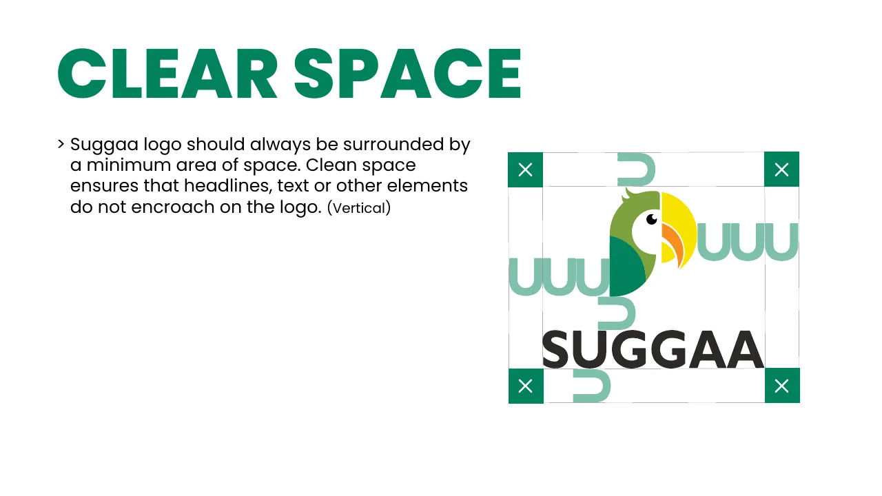
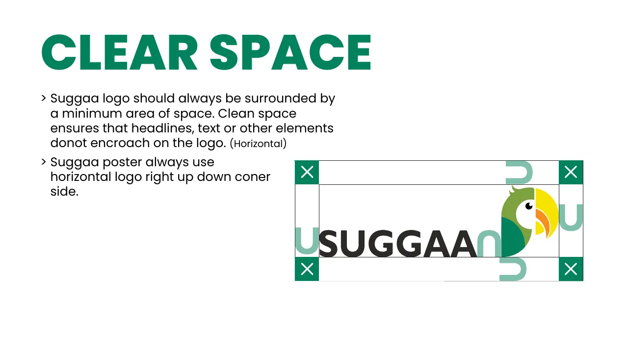
Always keep at least one U of empty space on every side. Headlines, text and other elements never come inside this area.

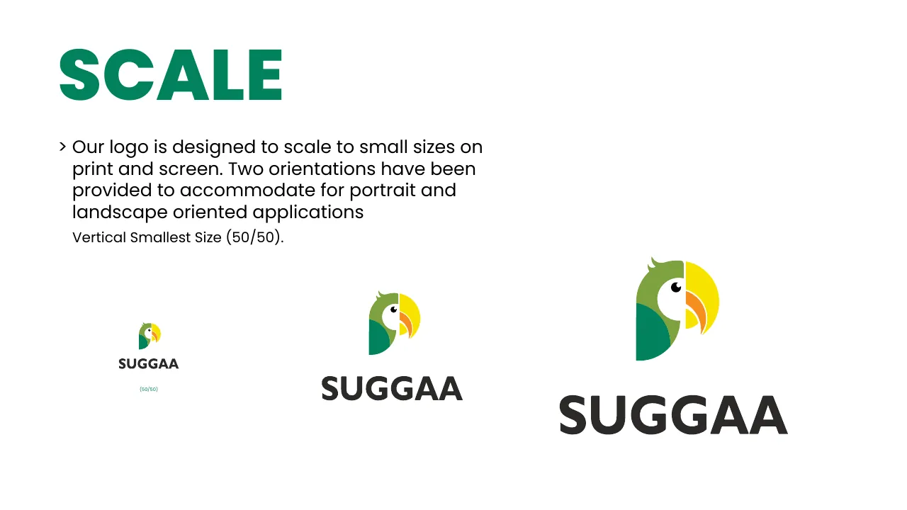
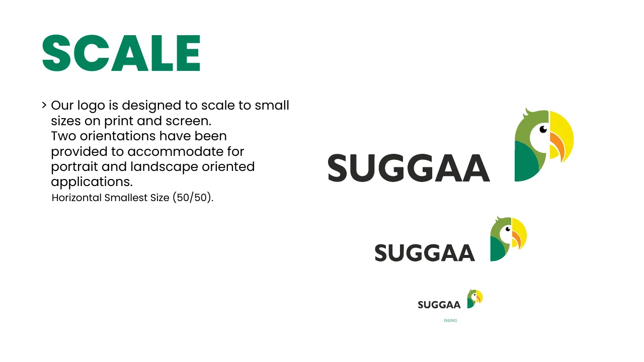
Smallest · 50 px
Small
Regular

The logo scales for print and screen in both orientations — never smaller than 50 px wide.

04 · Variations

Pick the background, I’ll pick the logo

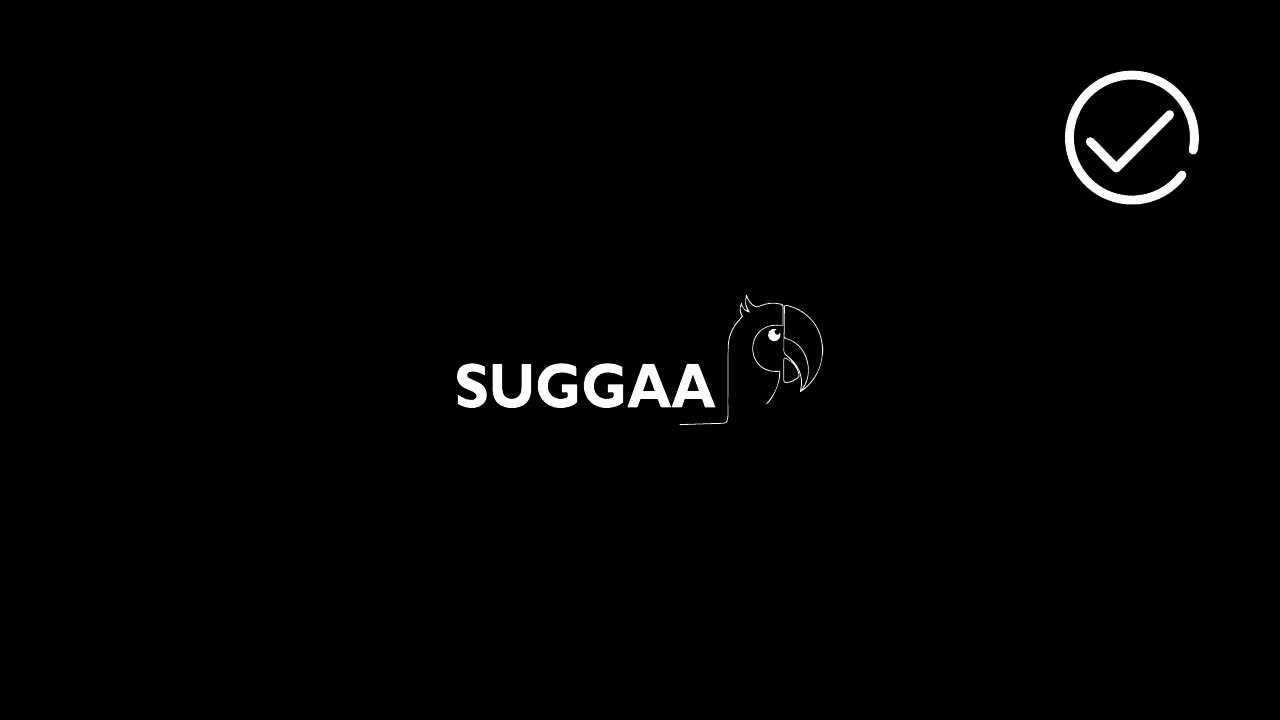
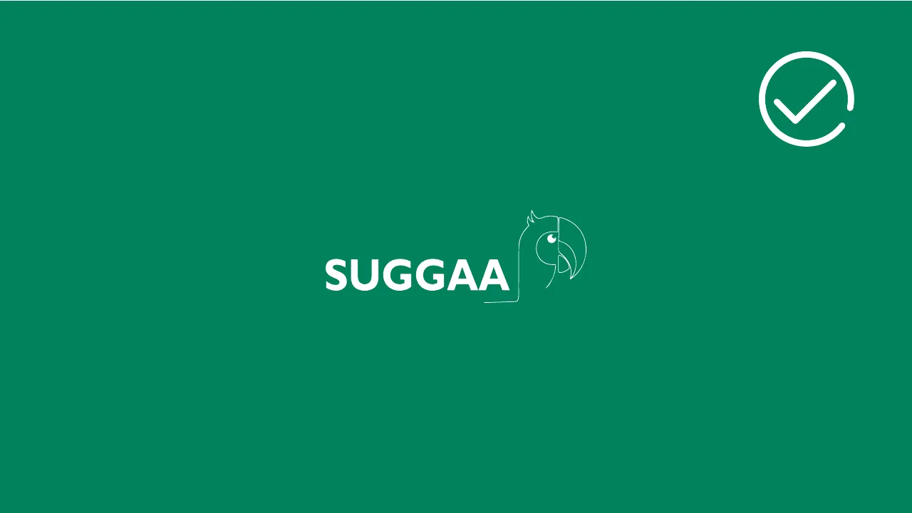
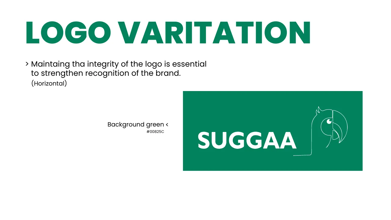
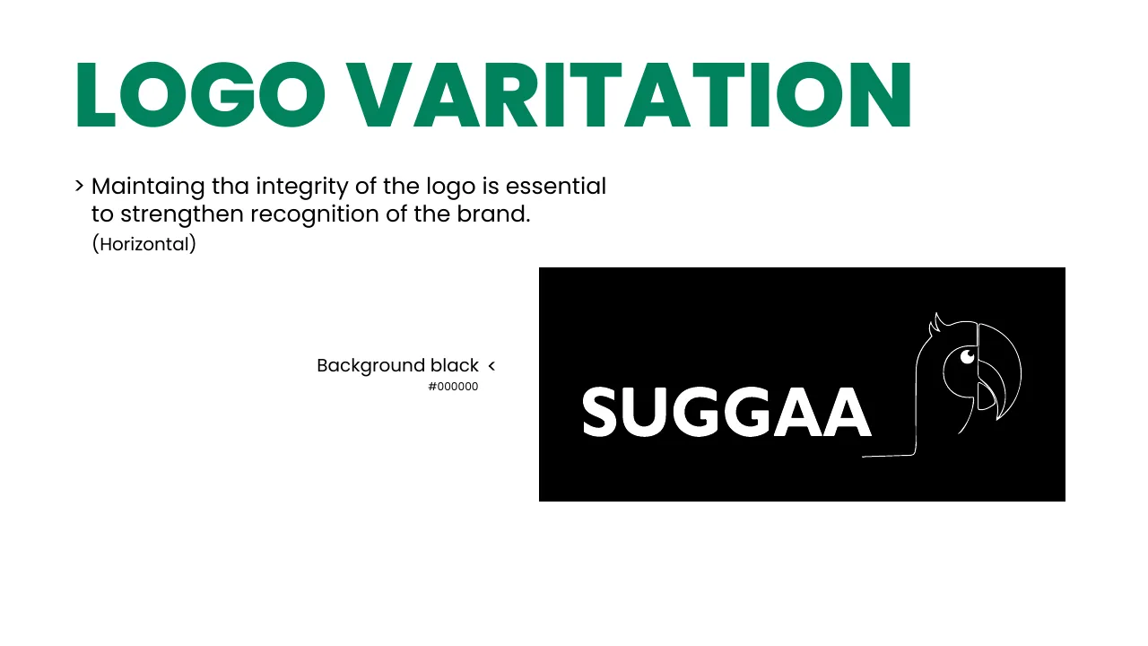
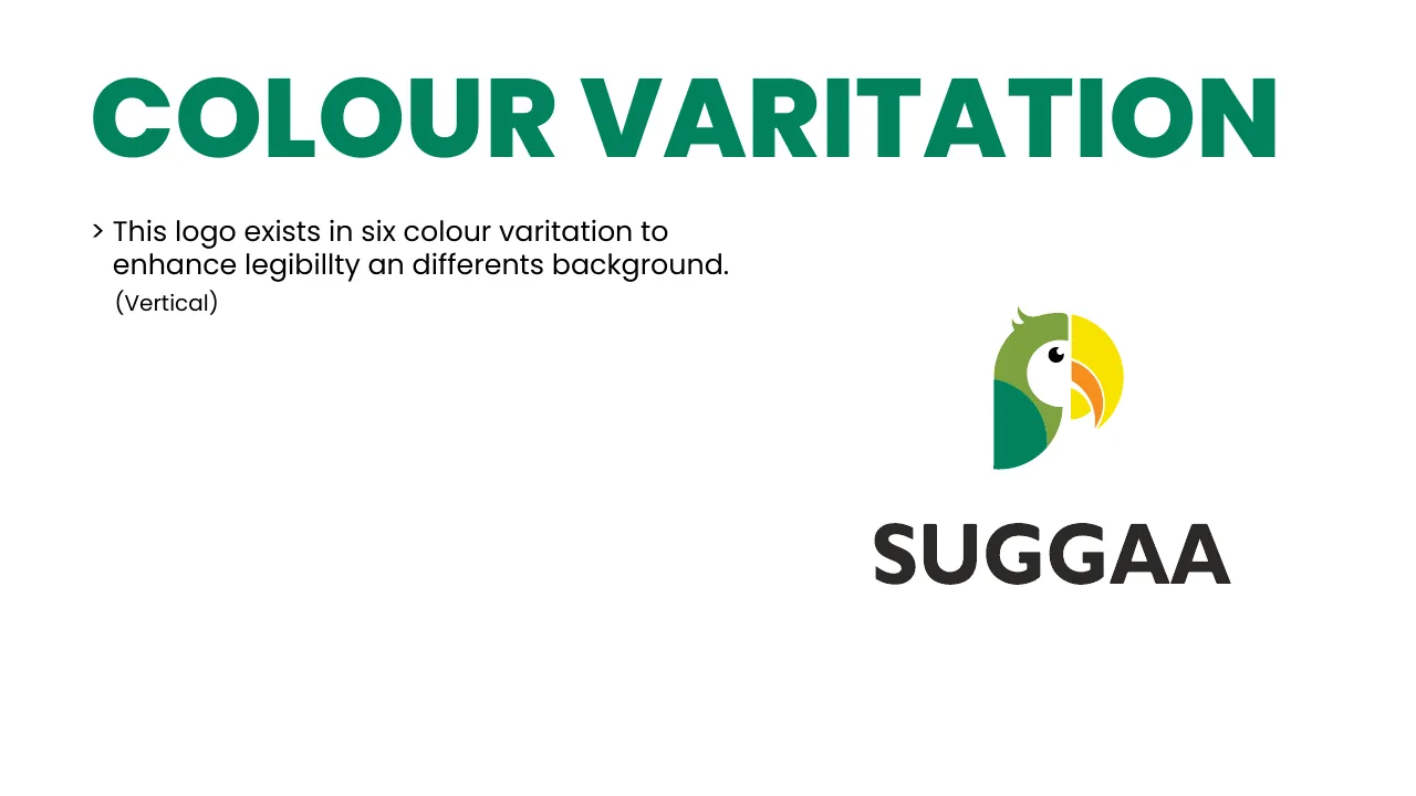
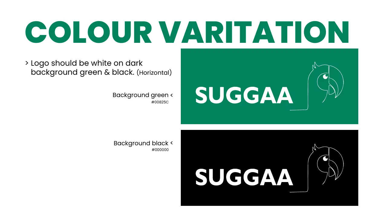
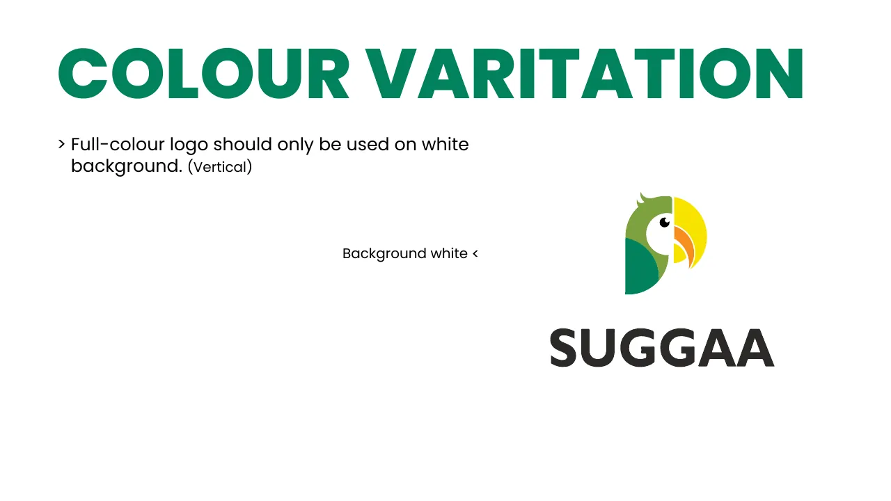
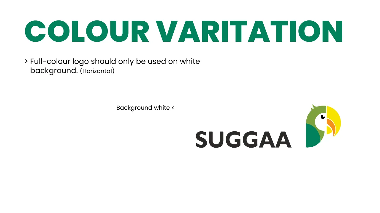
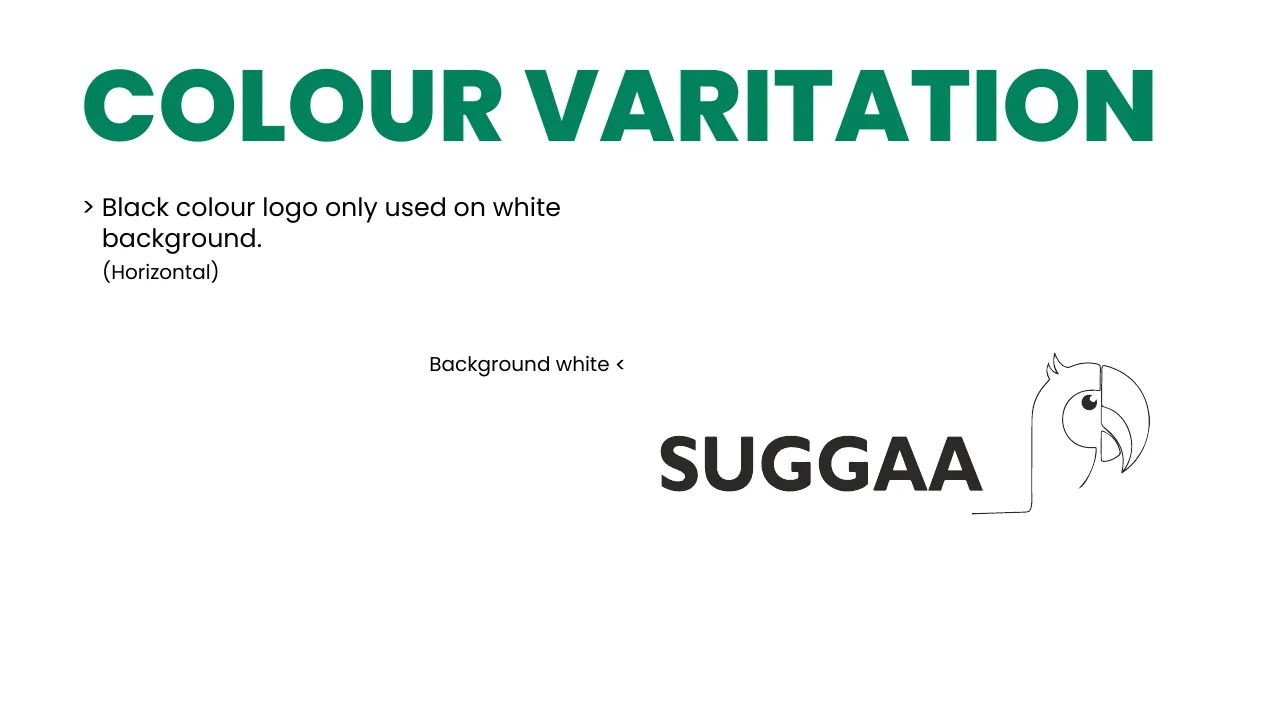
Full-colour logo on white White outline logo on Suggaa Green White outline logo on black Black outline logo on white

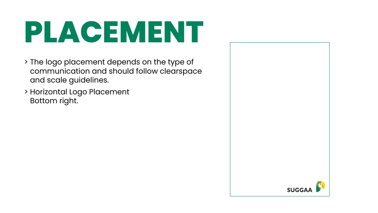
05 · Placement

Where the logo lives on a layout

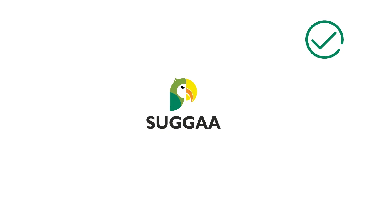
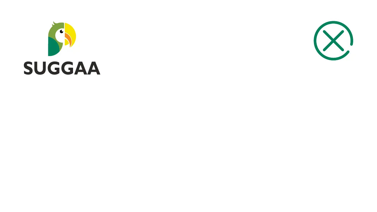
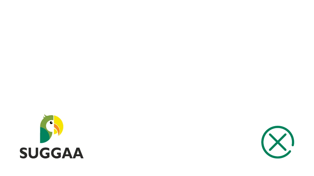
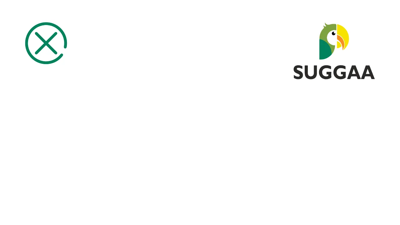
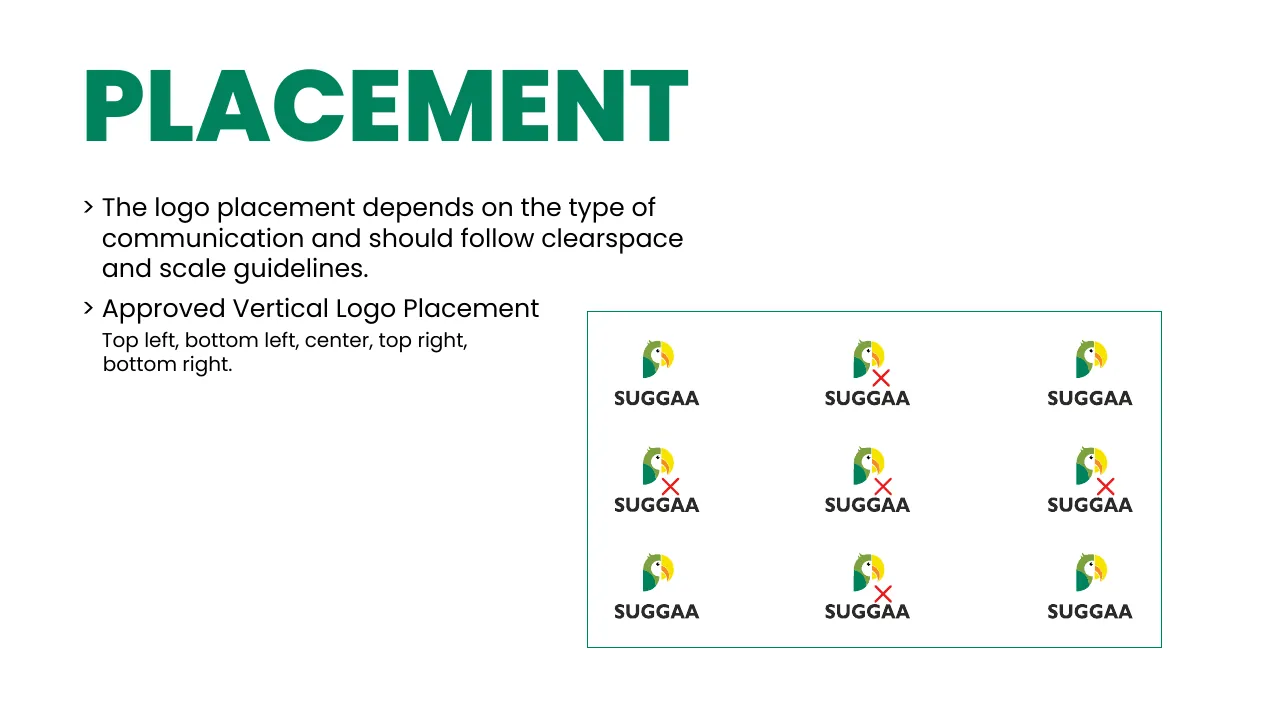
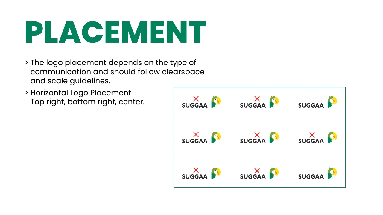
Tap a spot on the artboard. Horizontal logos sit top right or bottom right; the vertical logo sits in the centre.
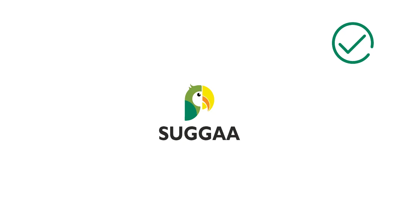

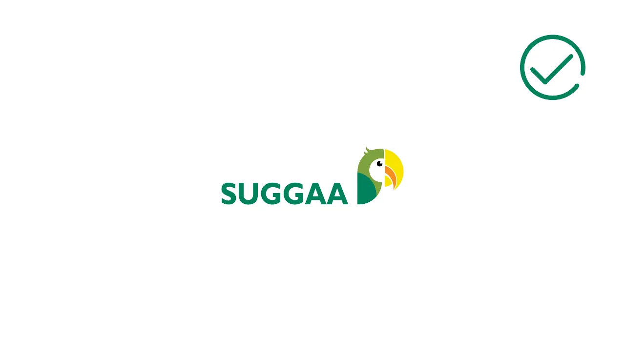
Logo placement example 1: Full-colour logo on white
✓ DoFull-colour logo on white
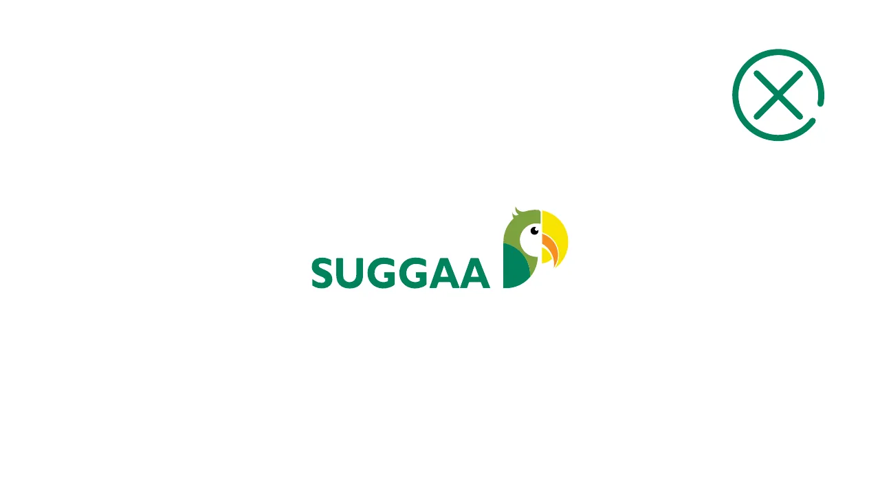
Logo placement example 2: Full-colour logo on Suggaa Green — the wordmark disappears
✕ Don’tFull-colour logo on Suggaa Green — the wordmark disappears
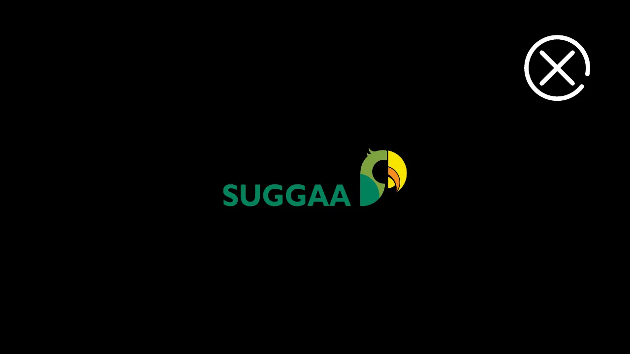
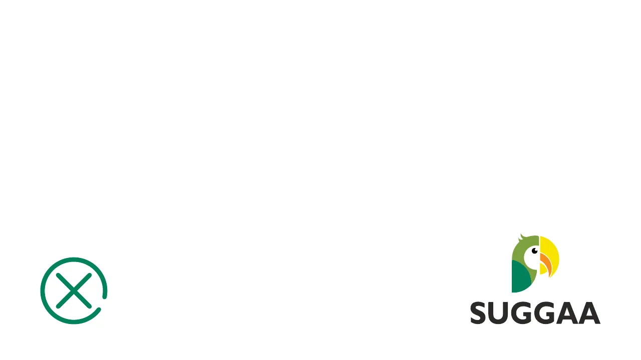
Logo placement example 3: Full-colour logo on black — the wordmark can't be read
✕ Don’tFull-colour logo on black — the wordmark can't be read
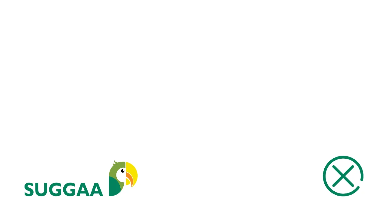
Logo placement example 4: Symbol alone on Suggaa Green
✕ Don’tSymbol alone on Suggaa Green
Logo placement example 5: White outline logo on black
✓ DoWhite outline logo on black
Logo placement example 6: White outline logo on Suggaa Green
✓ DoWhite outline logo on Suggaa Green
Logo placement example 7: Green wordmark on black — too little contrast
✕ Don’tGreen wordmark on black — too little contrast
Logo placement example 8: Green wordmark with the colour symbol, on white
✓ DoGreen wordmark with the colour symbol, on white
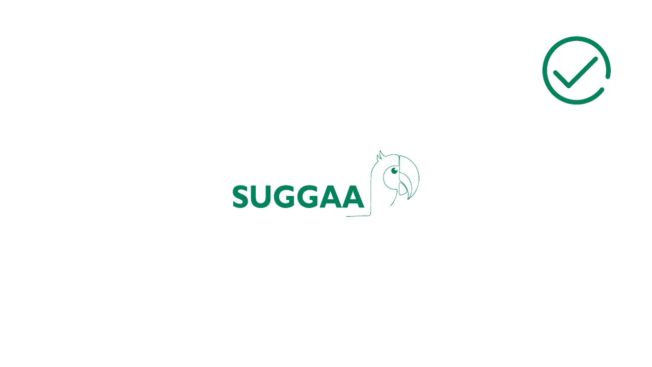
Logo placement example 9: Green outline logo on white
✓ DoGreen outline logo on white
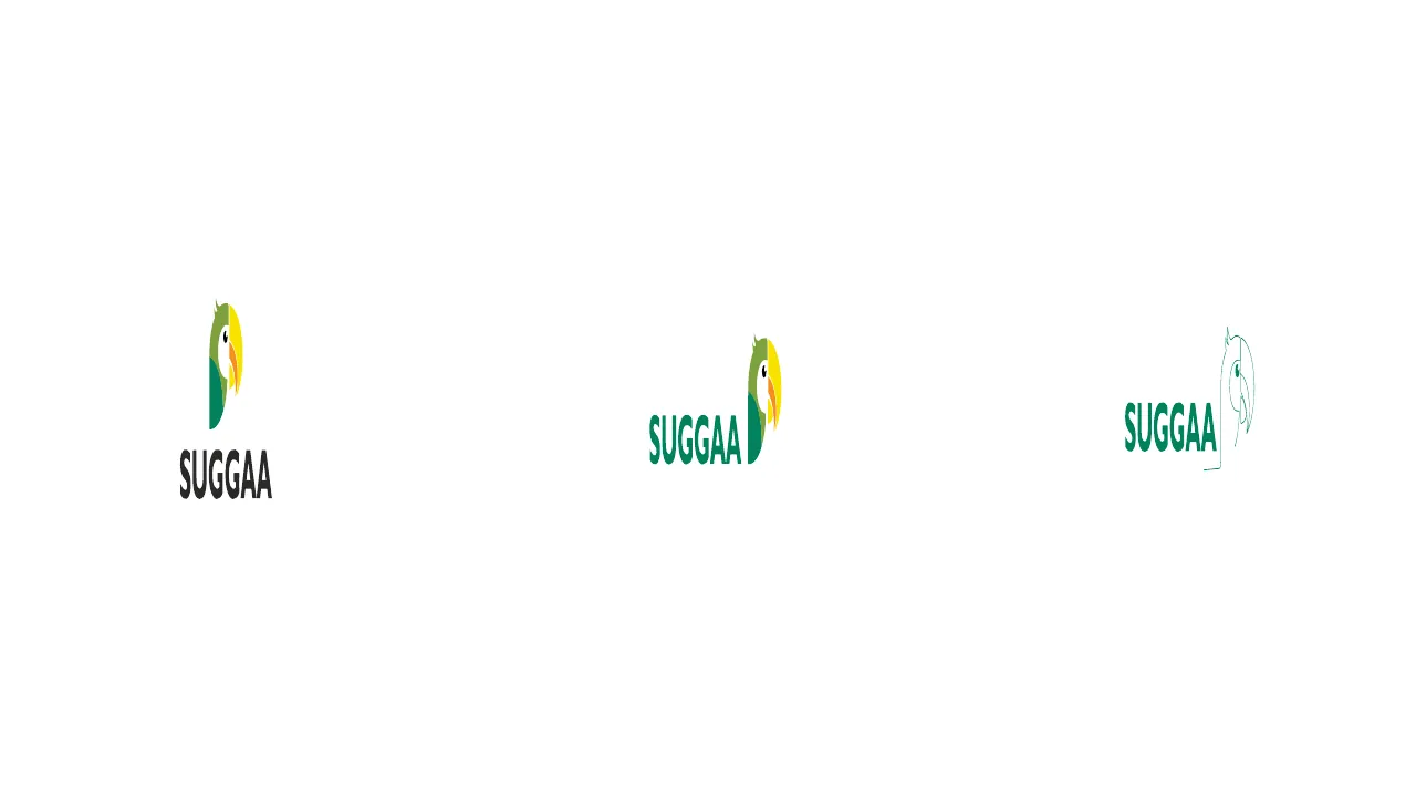
Logo placement example 10: The logo family at small sizes
SizesThe logo family at small sizes
Logo placement example 11: Vertical logo — centred
✓ DoVertical logo — centred
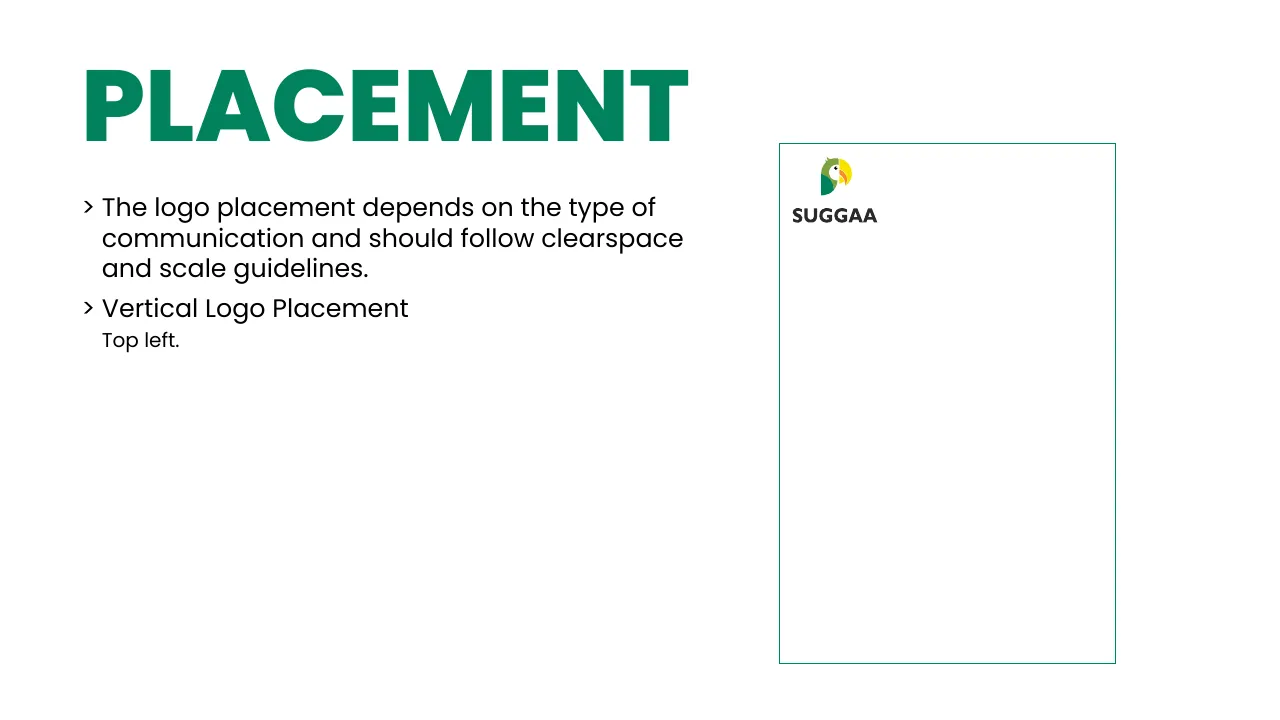
Logo placement example 12: Vertical logo pushed into a corner (top left)
✕ Don’tVertical logo pushed into a corner (top left)
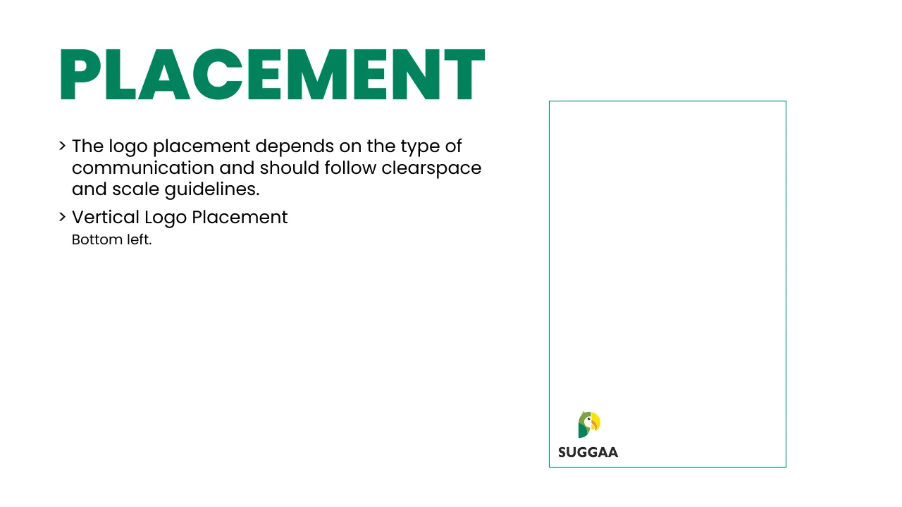
Logo placement example 13: Vertical logo bottom left
✕ Don’tVertical logo bottom left
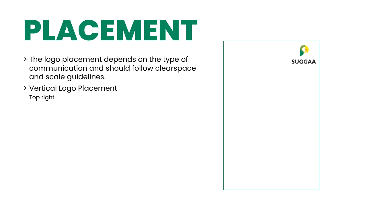
Logo placement example 14: Vertical logo top right
✕ Don’tVertical logo top right
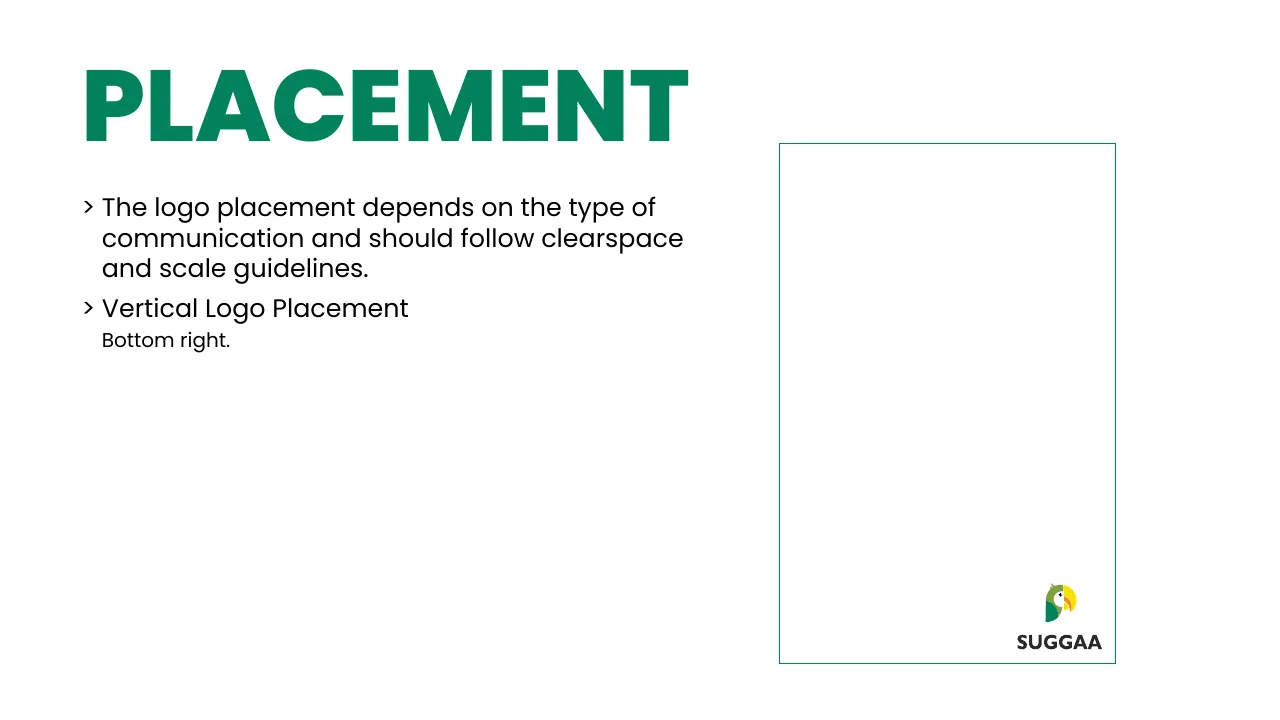
Logo placement example 15: Vertical logo bottom right
✕ Don’tVertical logo bottom right
Logo placement example 16: Horizontal logo centred
✕ Don’tHorizontal logo centred
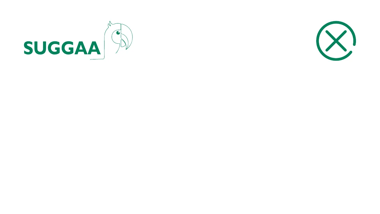
Logo placement example 17: Outline logo top left
✕ Don’tOutline logo top left
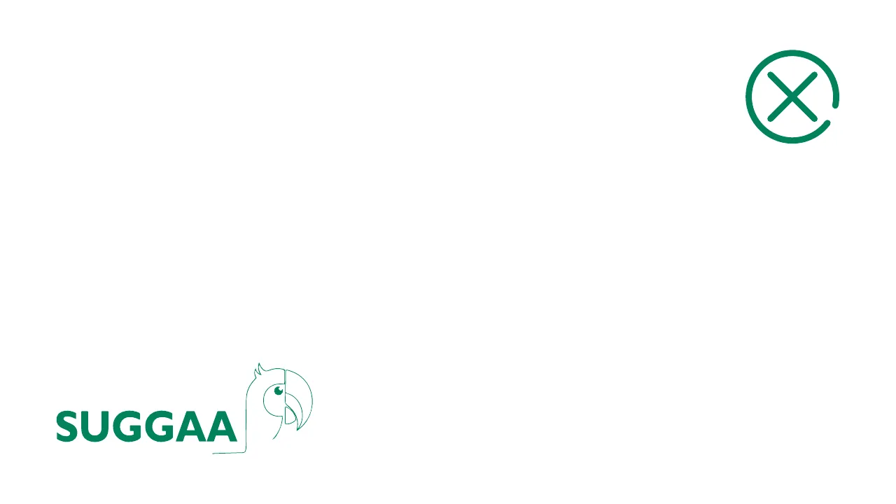
Logo placement example 18: Outline logo bottom left
✕ Don’tOutline logo bottom left
Logo placement example 19: Horizontal logo bottom left
✕ Don’tHorizontal logo bottom left
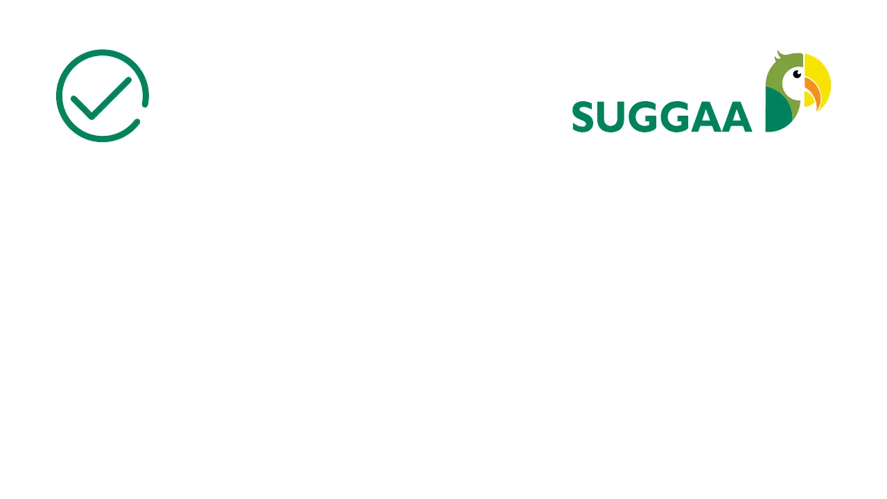
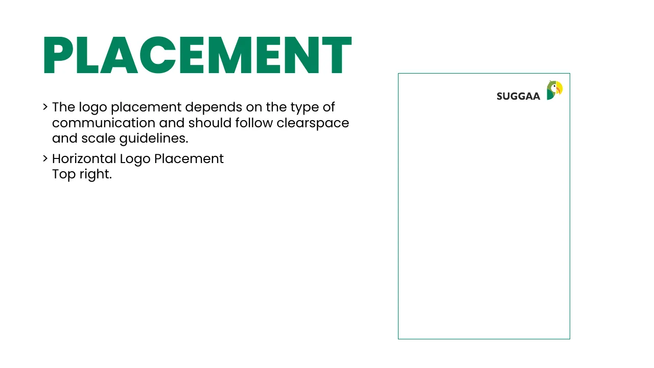
Logo placement example 20: Horizontal logo top right
✓ DoHorizontal logo top right
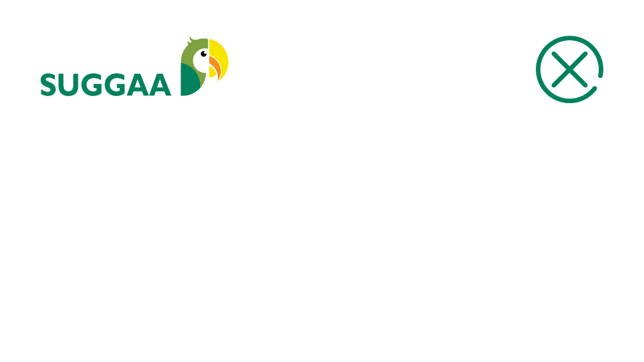
Logo placement example 21: Horizontal logo top left
✕ Don’tHorizontal logo top left
Logo placement example 22: Horizontal logo bottom right
✓ DoHorizontal logo bottom right
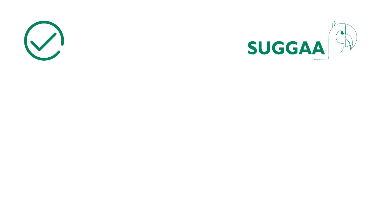
Logo placement example 23: Outline logo top right
✓ DoOutline logo top right
Logo placement example 24: Outline logo bottom right
✓ DoOutline logo bottom right
Logo placement example 25: Outline logo centred
✕ Don’tOutline logo centred
Logo placement example 26: White outline logo on Suggaa Green, placed right
✓ DoWhite outline logo on Suggaa Green, placed right
Logo placement example 27: White outline logo bottom left on green
✕ Don’tWhite outline logo bottom left on green
Logo placement example 28: White outline logo on Suggaa Green, placed right
✓ DoWhite outline logo on Suggaa Green, placed right
Logo placement example 29: White outline logo top left on green
✕ Don’tWhite outline logo top left on green
Logo placement example 30: White outline logo centred on green
✕ Don’tWhite outline logo centred on green
Logo placement example 31: Full-colour logo on black
✕ Don’tFull-colour logo on black
Logo placement example 32: Sizes — vertical, horizontal and outline
SizesSizes — vertical, horizontal and outline
Logo placement example 33: Sizes — smallest use
SizesSizes — smallest use

Partnerships

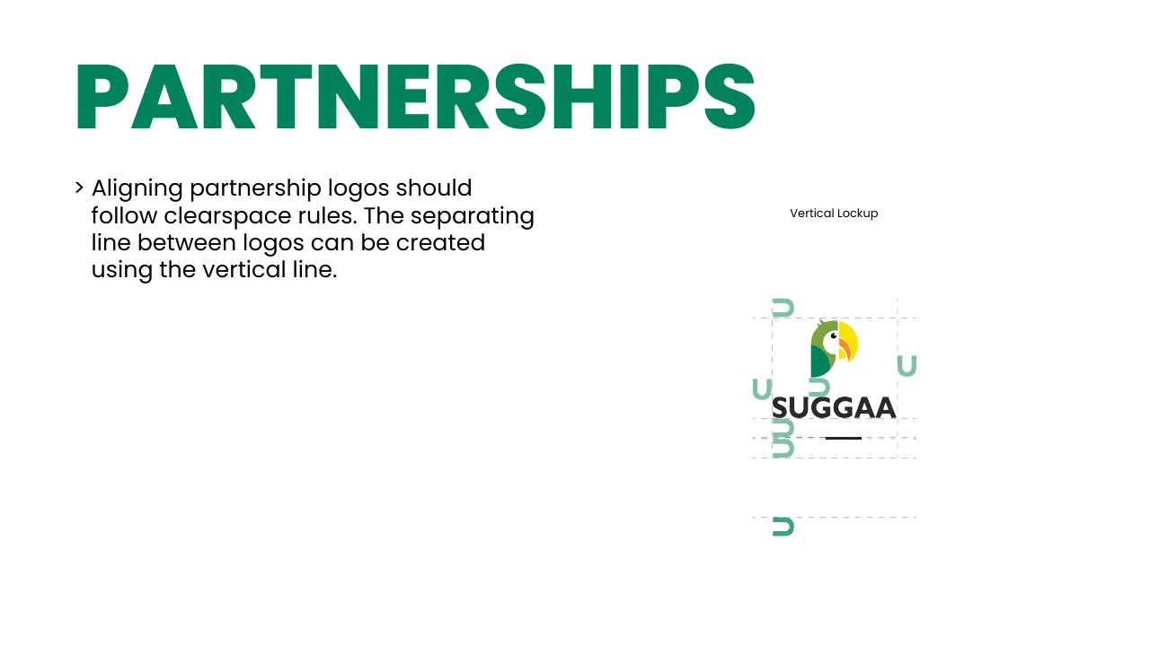
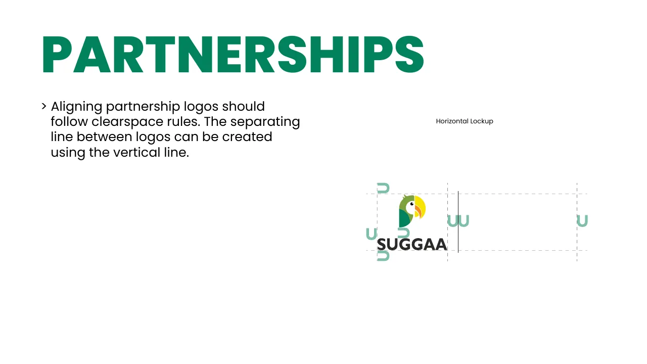
Partner logos follow the same clear space. A thin vertical line separates Suggaa from the partner — in the vertical or horizontal lockup.
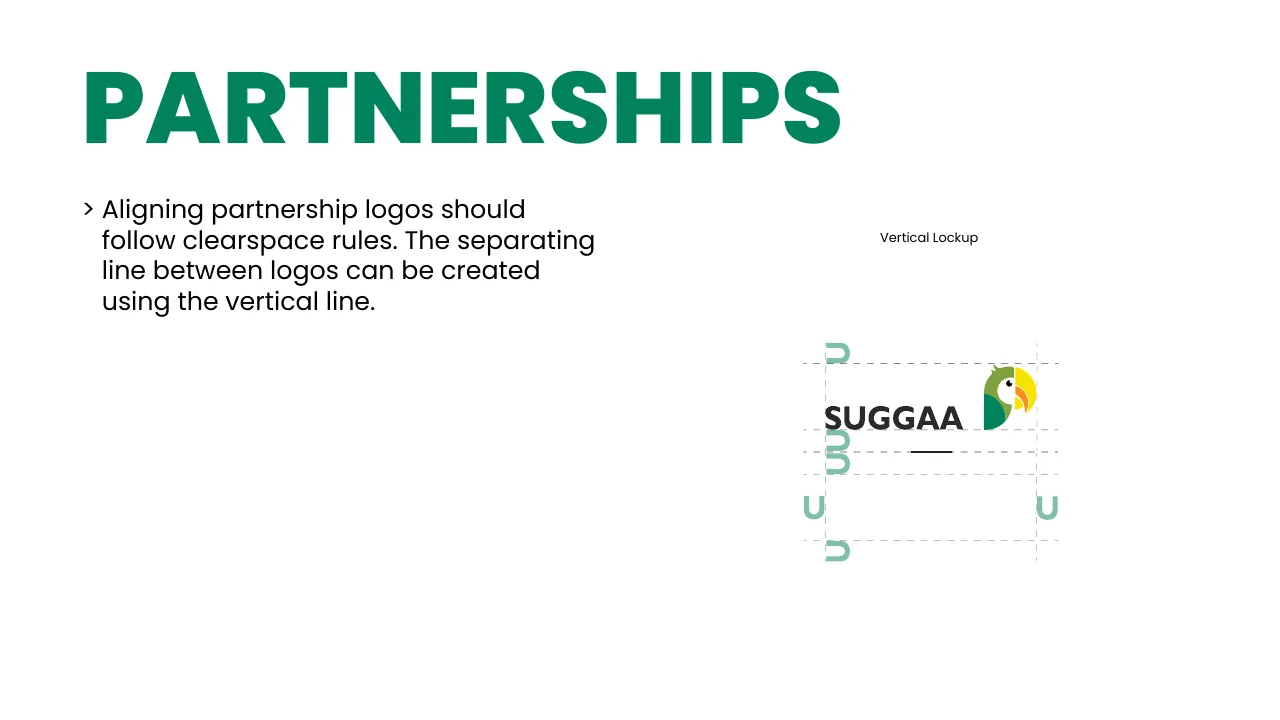
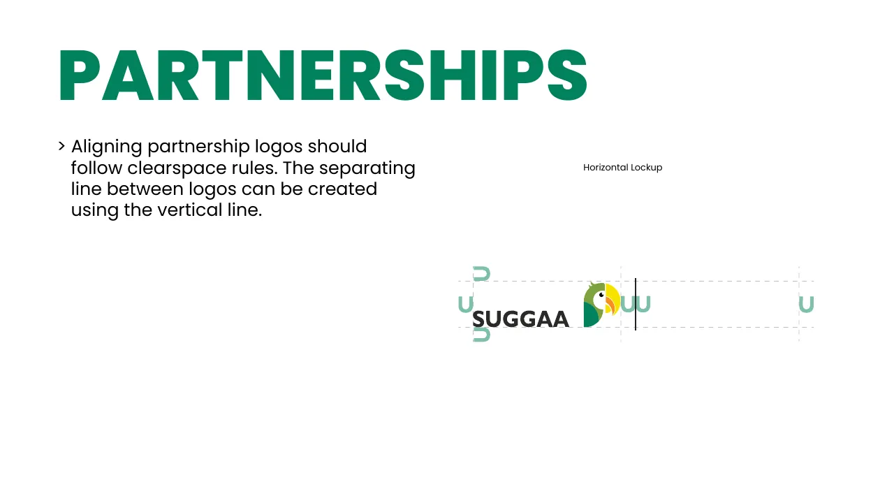
Partnership lockup, page 37
Partnership lockup, page 38
Partnership lockup, page 39
Partnership lockup, page 40
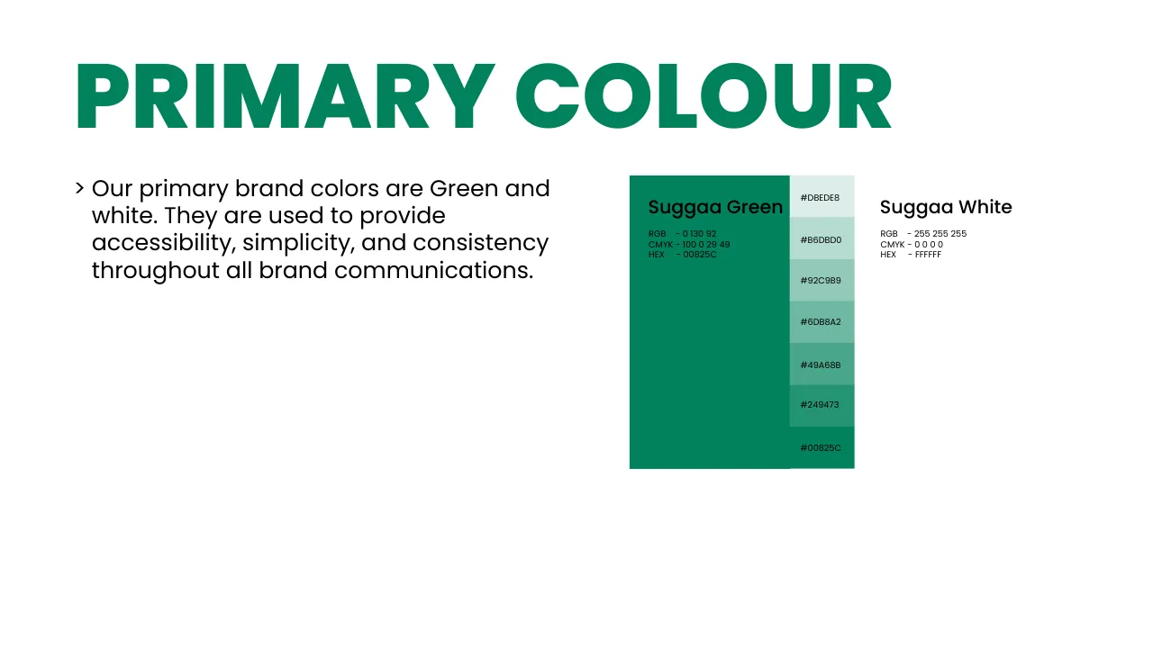
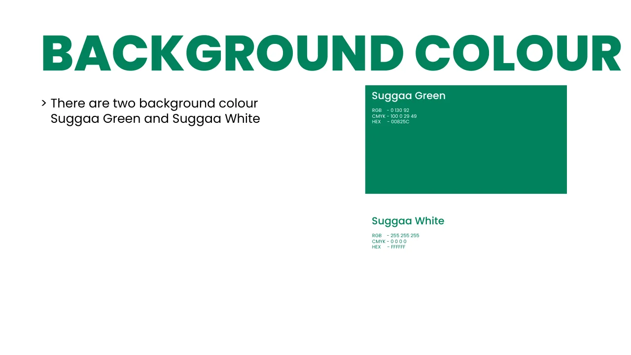
06 · Colour

Green for go, white for trust

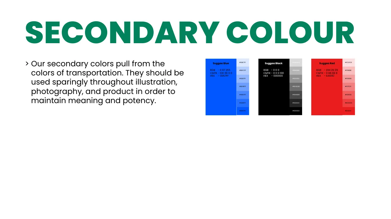
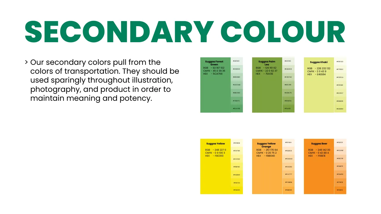
Suggaa Green and Suggaa White are the brand. The secondary colours come from the colours of transport — signals, lanes and taxis — and are used sparingly in illustration, photography and product. Click any colour to copy its HEX.

RGB
0 130 92
CMYK
100 0 29 49
Use
Main brand colour · backgrounds, buttons, headlines
RGB
255 255 255
CMYK
0 0 0 0
Use
The second background colour · space to breathe

Secondary colours

RGB
92 167 102
CMYK
45 0 39 35
Use
Highlights on white
RGB
126 161 62
CMYK
22 0 62 37
Use
Approval
RGB
228 232 132
CMYK
2 0 43 9
Use
Highlights on green
RGB
248 227 0
CMYK
0 9 100 3
Use
Warning
RGB
251 176 64
CMYK
0 20 75 2
Use
Body / skin colour
RGB
246 142 30
CMYK
0 42 88 4
Use
Attention & safety
RGB
0 87 255
CMYK
100 66 0 0
Use
Positive
RGB
0 0 0
CMYK
0 0 0 100
Use
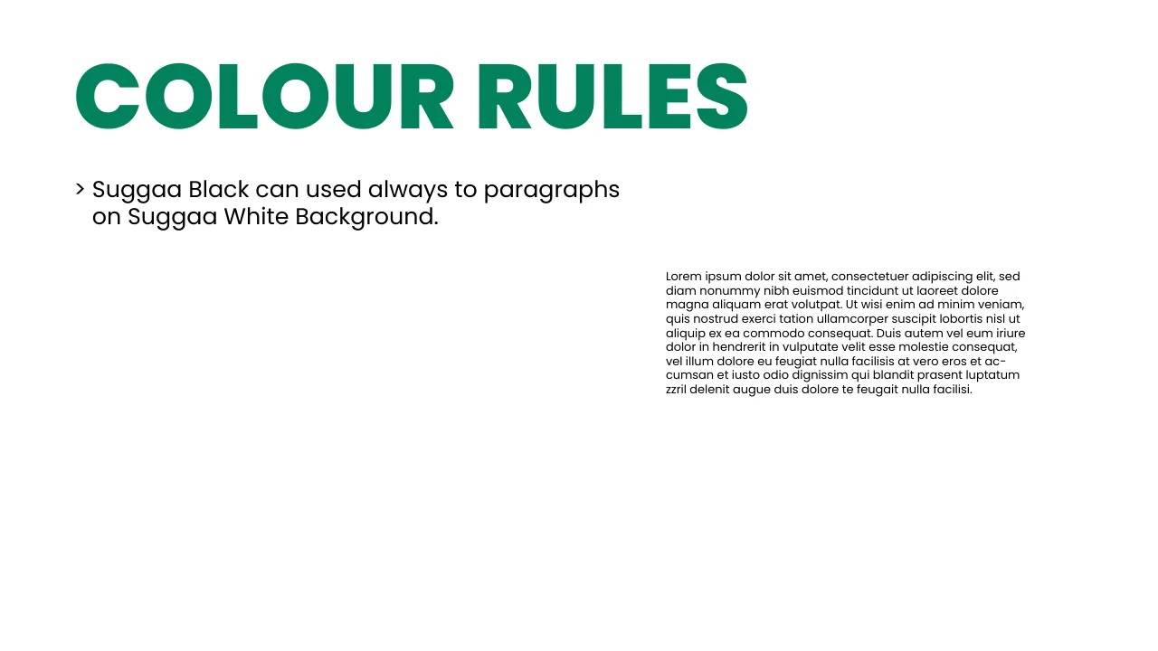
Paragraph text
RGB
234 29 29
CMYK
0 88 88 8
Use
Negative

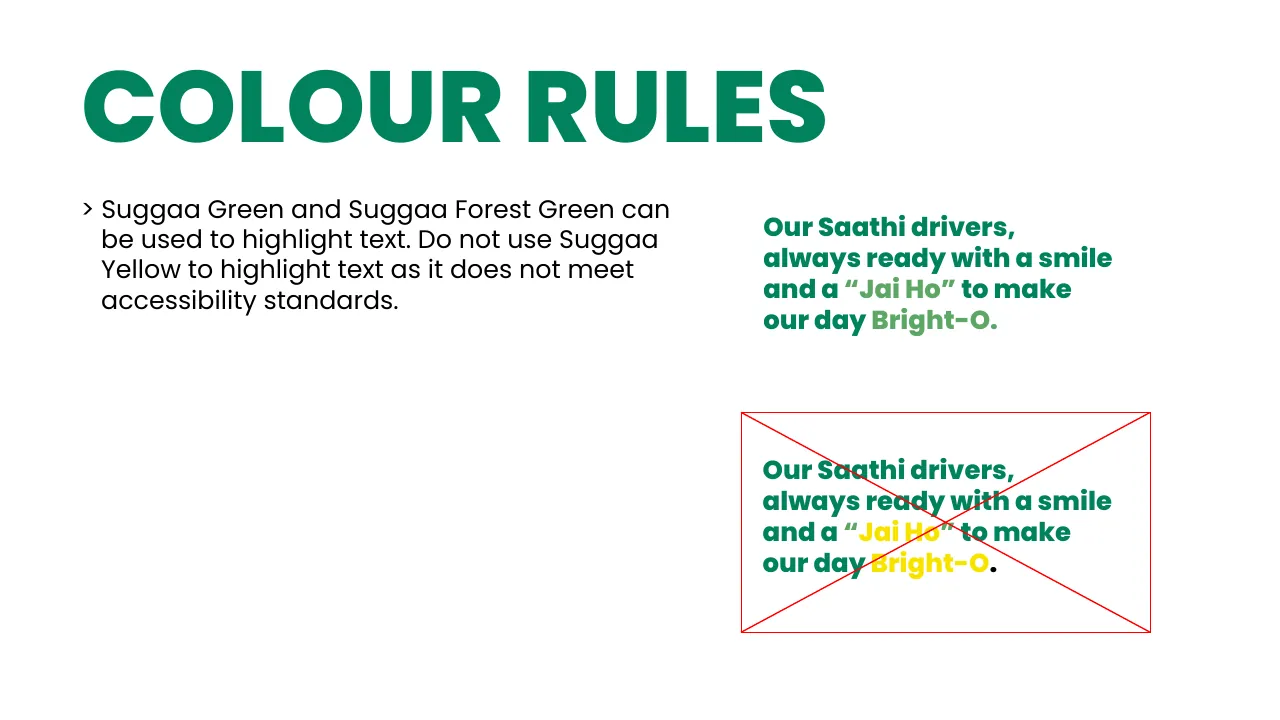
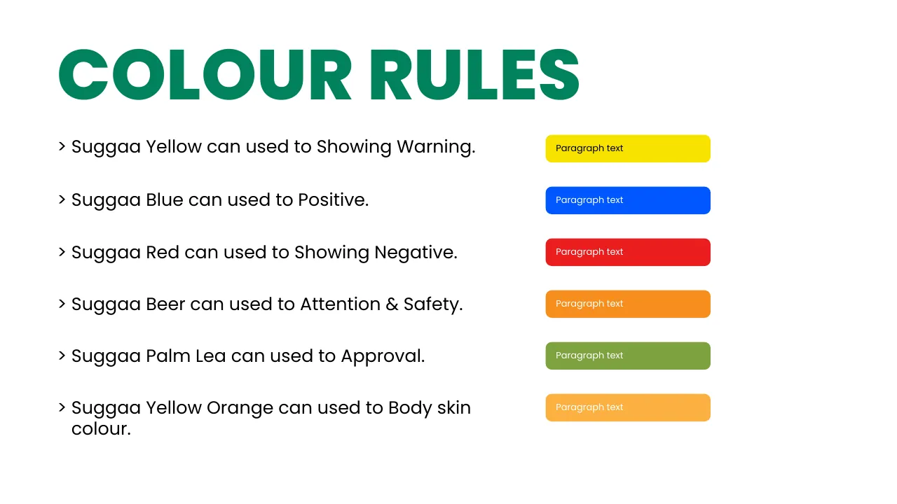
Colour rules

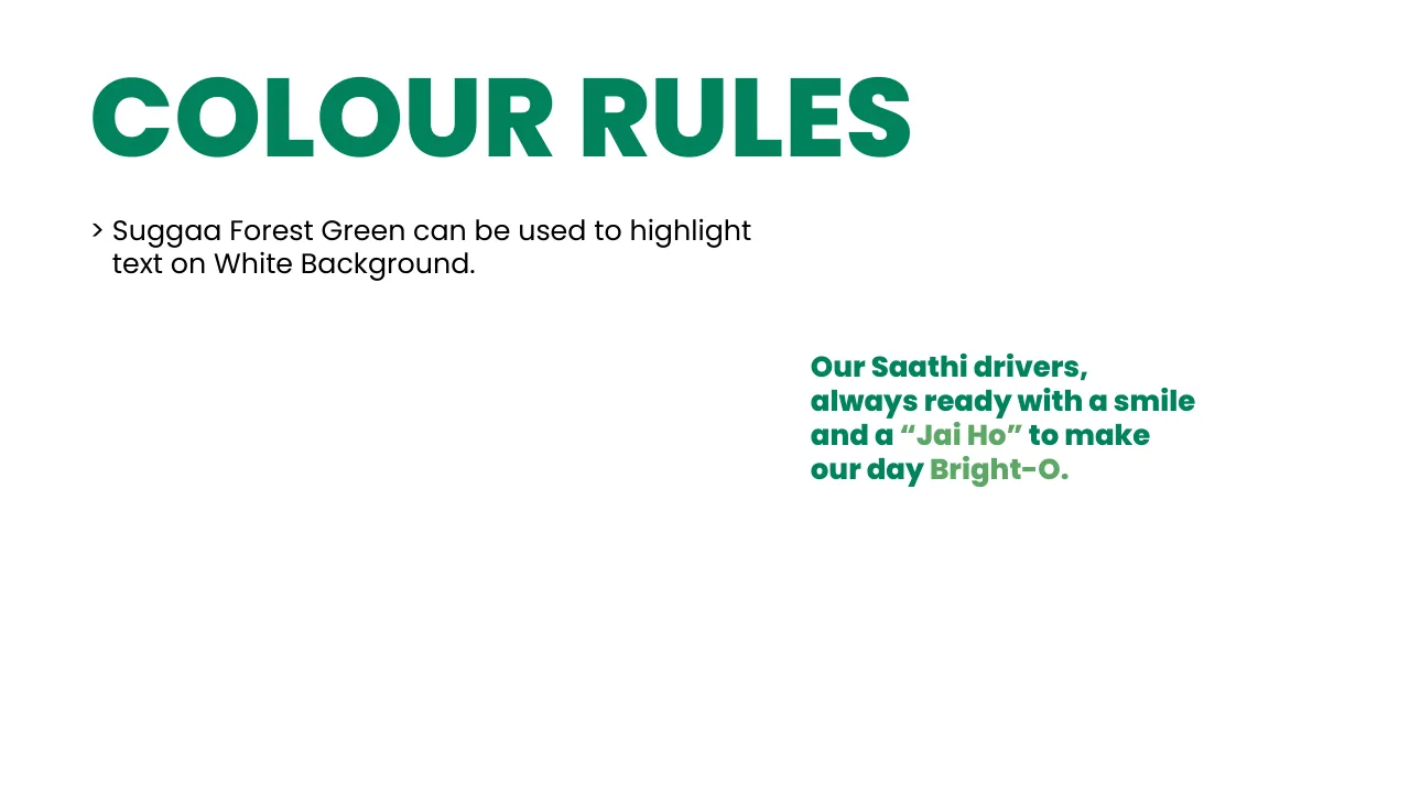
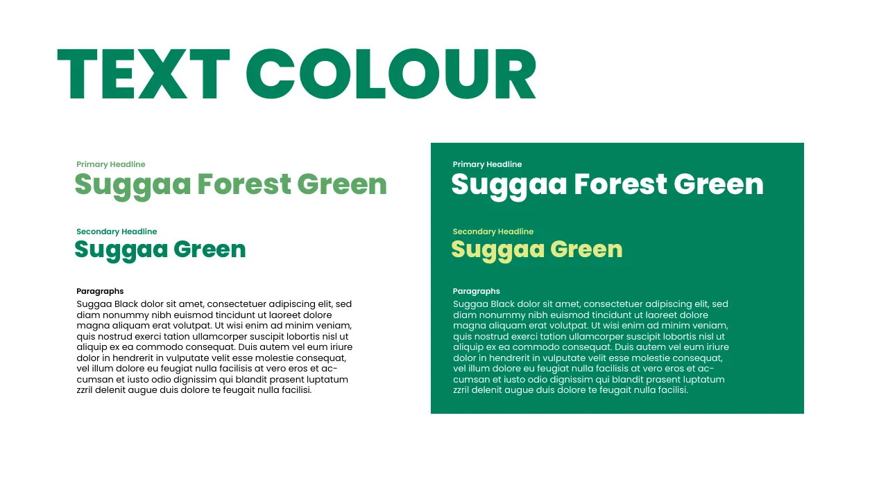
Our Saathi drivers, always ready with a smile and a “Jai Ho” to make our day Bright-O.

✓ Green highlights on white

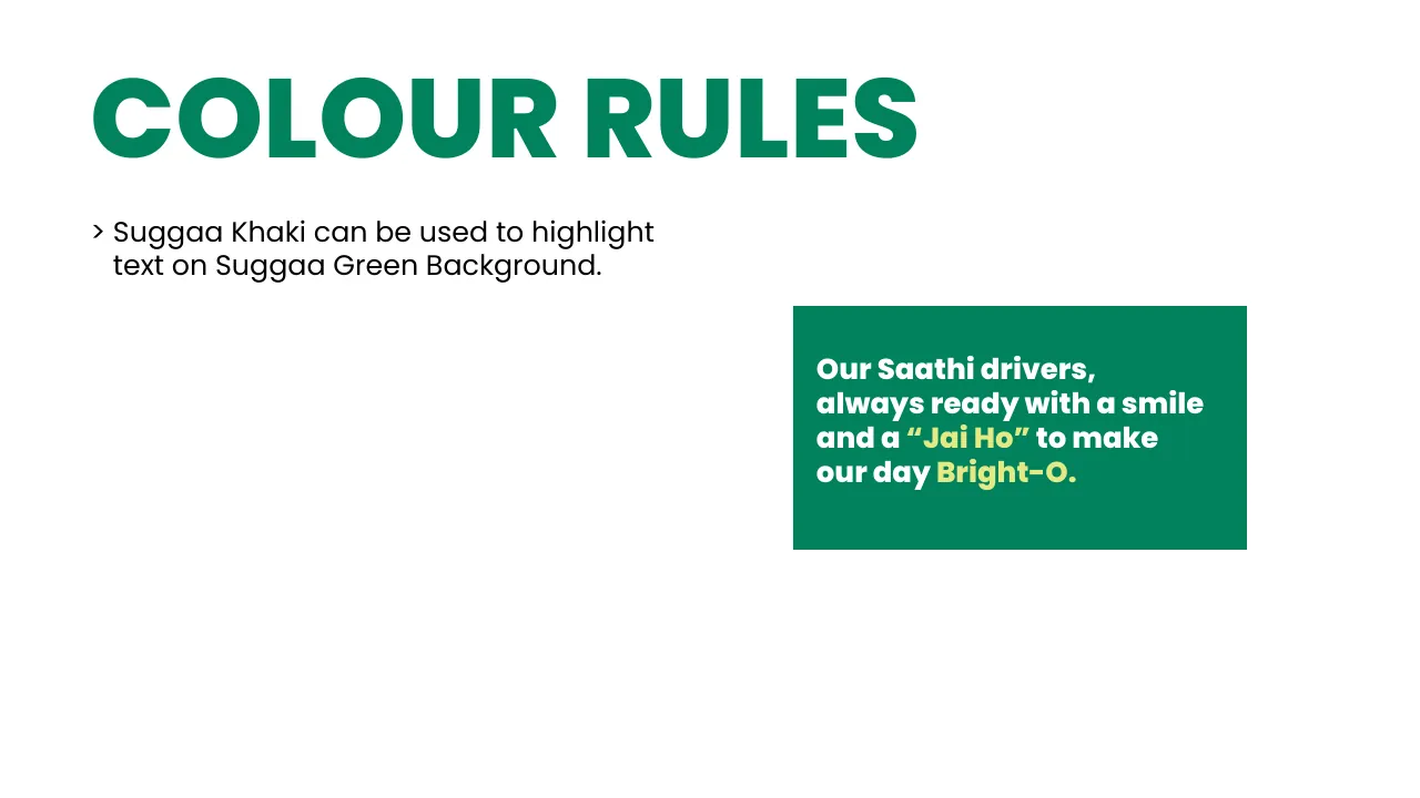
Our Saathi drivers, always ready with a smile and a “Jai Ho” to make our day Bright-O.

✓ Khaki highlights on Suggaa Green

Our Saathi drivers, always ready with a smile and a “Jai Ho” to make our day Bright-O.

✕ Never highlight with yellow — it fails accessibility
Yellow · warningBlue · positiveRed · negativeBeer · attention & safetyPalm Leaf · approvalYellow Orange · skin tones
07 · Typography

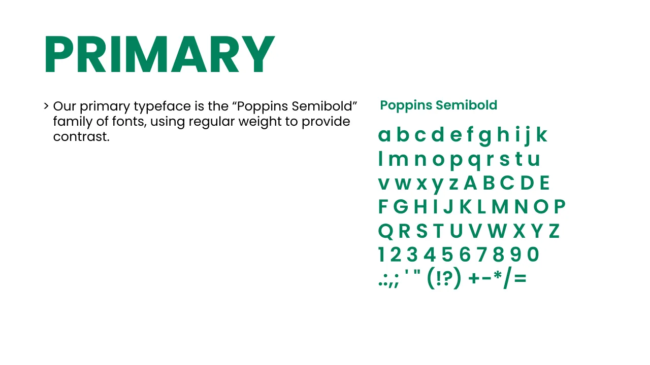
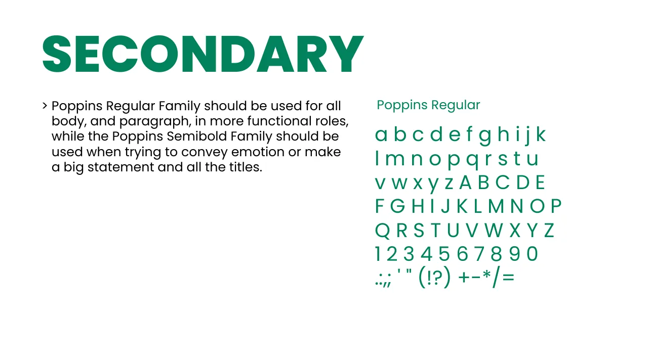
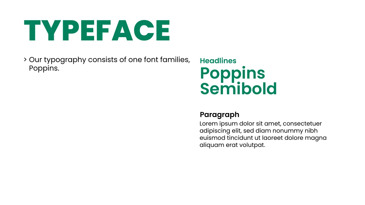
One family: Poppins

Aa
AaBbCcDdEeFfGgHhIiJjKkLlMmNnOoPpQqRrSsTtUuVvWwXxYyZz0123456789!?&@#
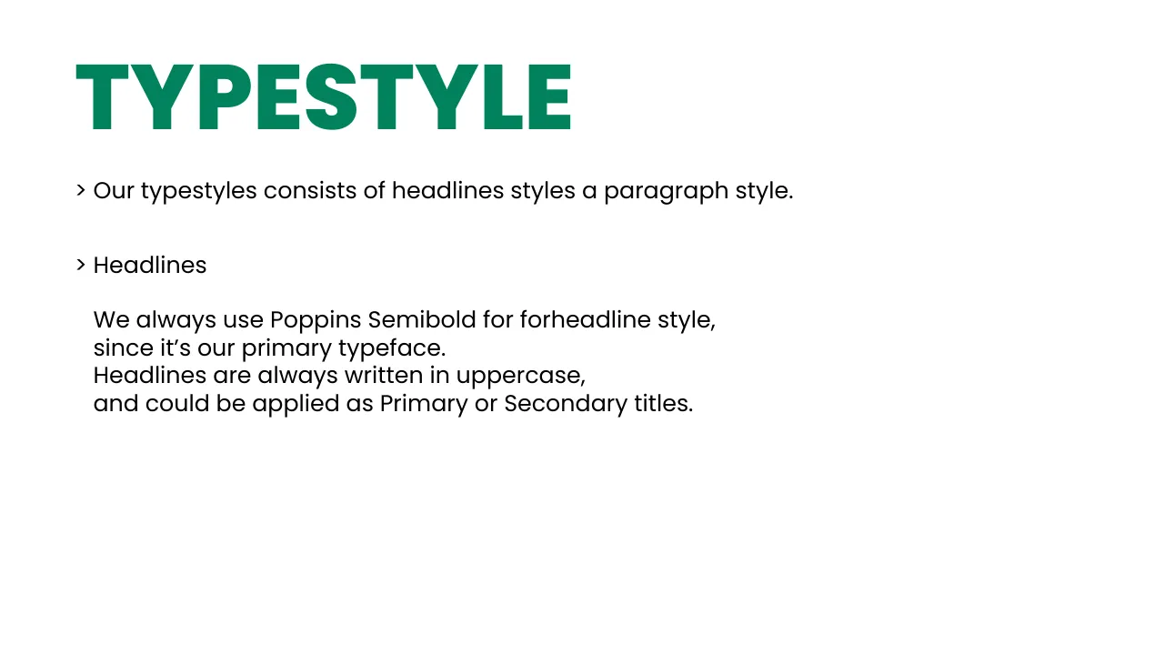
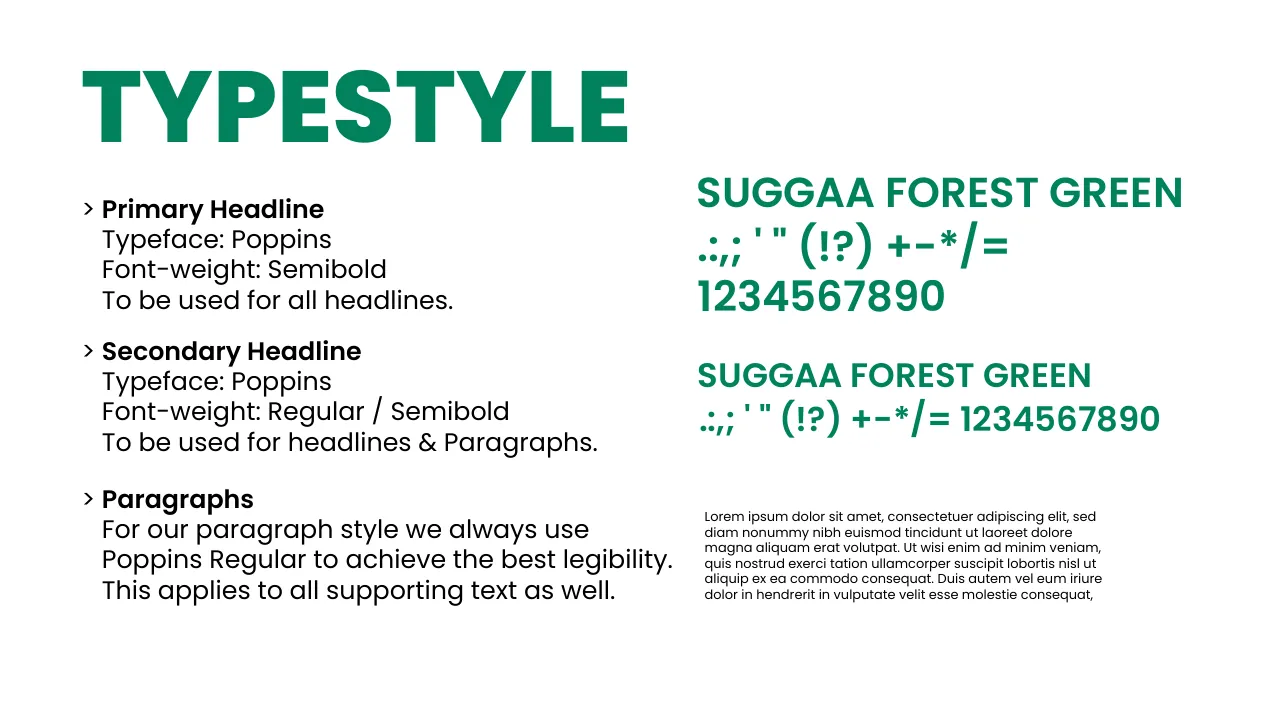
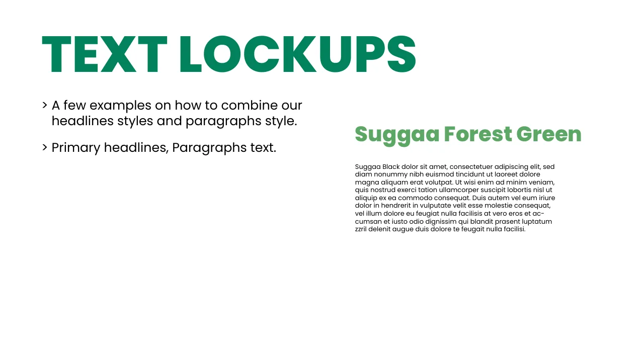
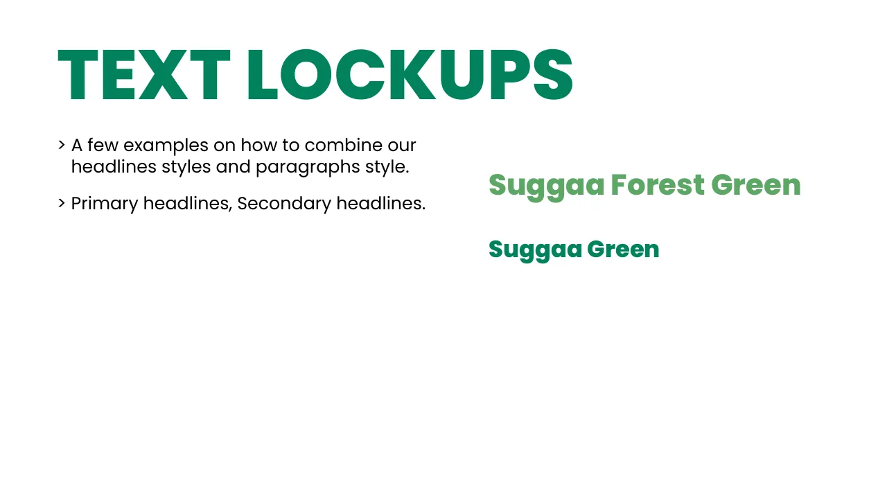
Primary headline · Poppins Semibold · uppercase · Forest Green

GET A RIDE IN MINUTES.

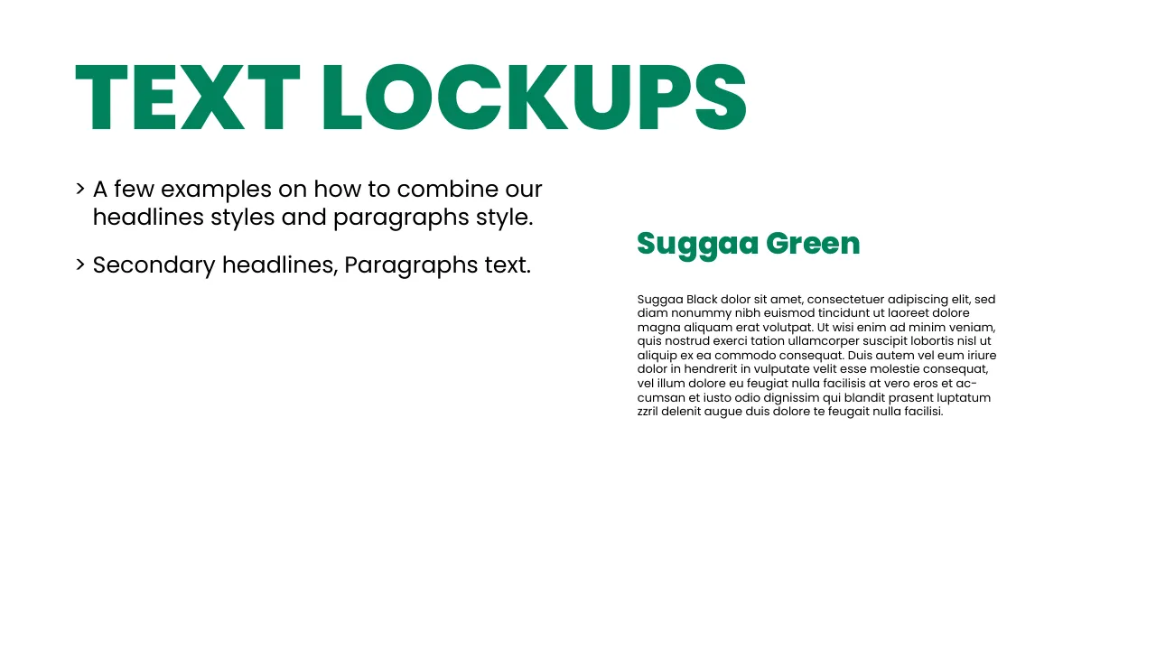
Secondary headline · Poppins Regular / Semibold · Suggaa Green

Shopping local. Ride Suggaa.

Paragraph · Poppins Regular · Suggaa Black

Leave the keys, let us do the driving. Our Saathi drivers know every shortcut in the city — and greet you with a smile.
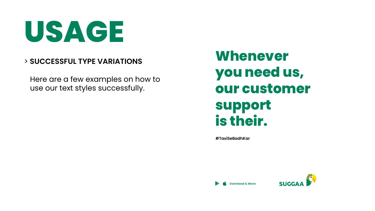
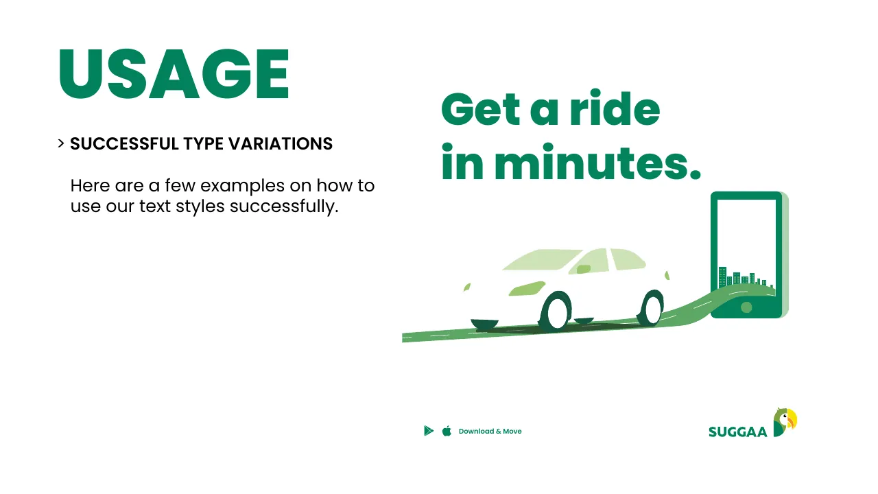
Try it
Type anything — it’s Poppins.

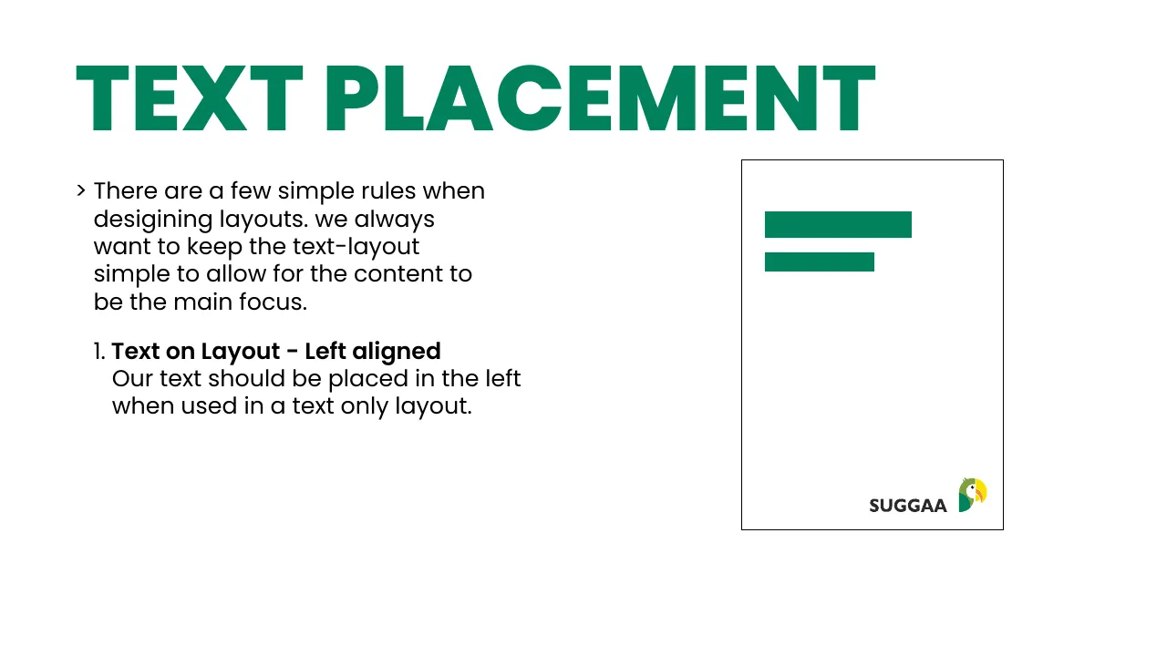
Text placement

1 · Text only — left aligned, top left.
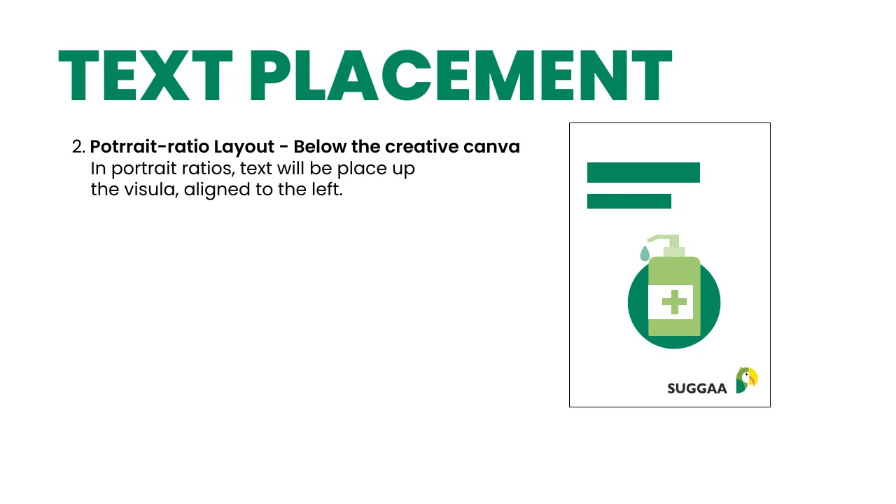
2 · Portrait — text above the visual, left aligned.
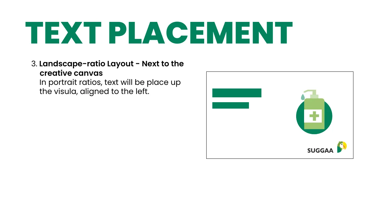
3 · Landscape — text left, visual on the right.
08 · Usage

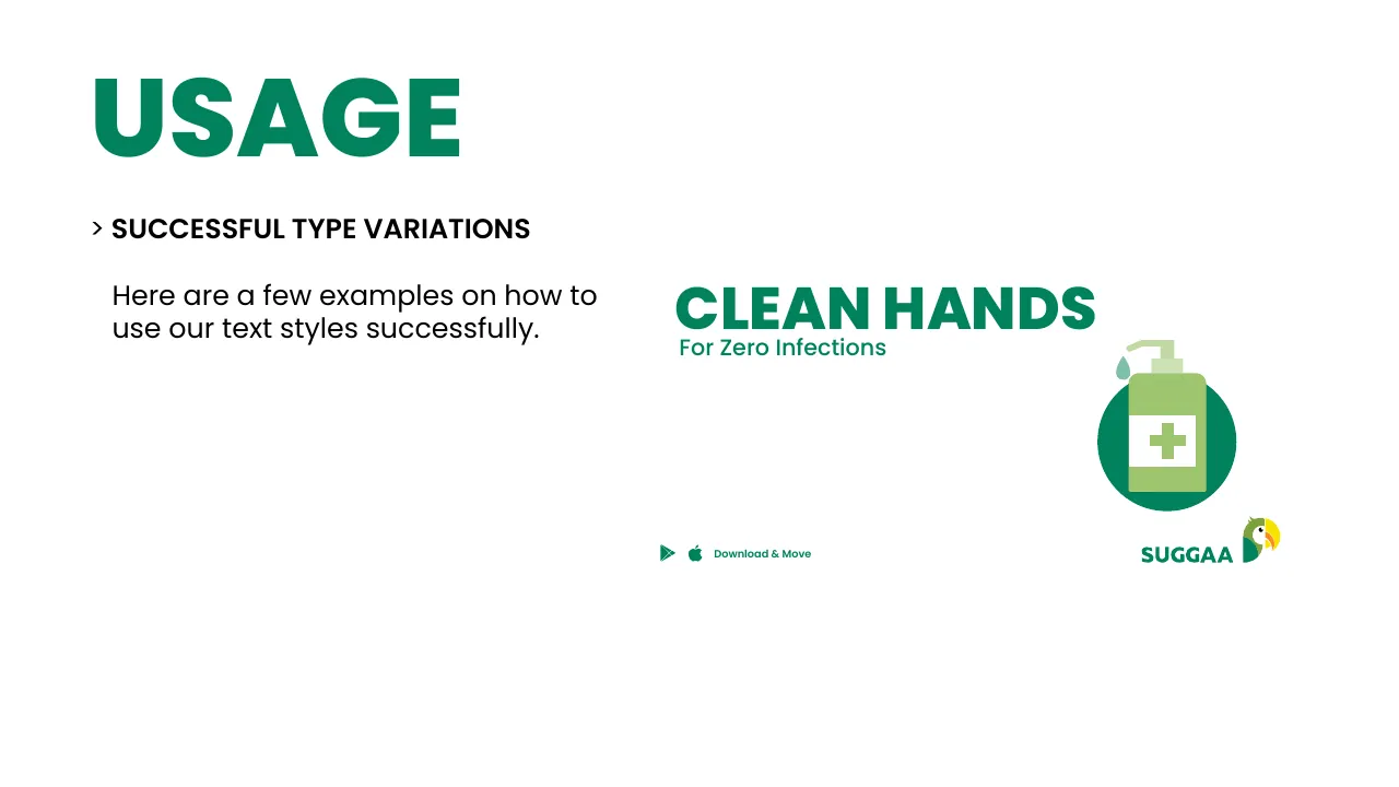
Say one thing, say it big

Usage example 63
✓ DoBig, simple headline · clear call-out
Usage example 64
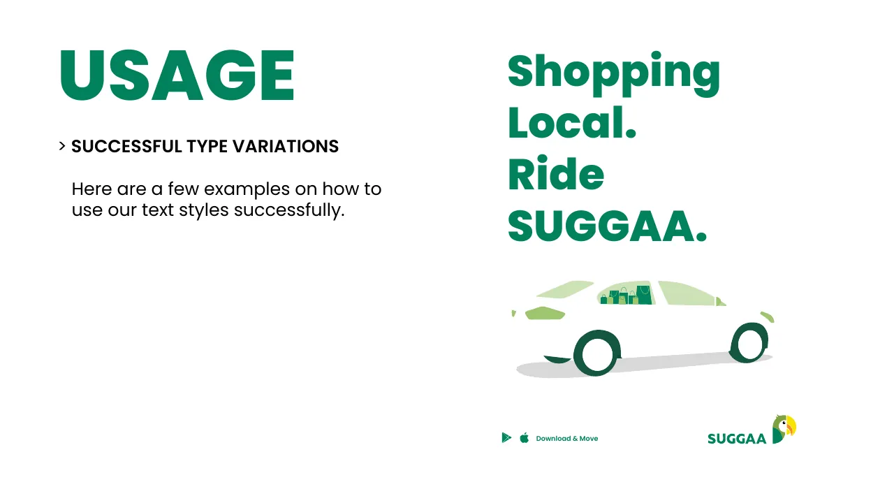
✓ DoShort line · illustration in brand colours
Usage example 65
✓ DoBold rhythm, one idea per line
Usage example 66
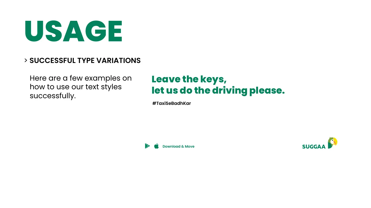
✓ DoFriendly voice, one line, lots of air
Usage example 67
✓ DoMessage + icon, both in Suggaa Green
Usage example 68
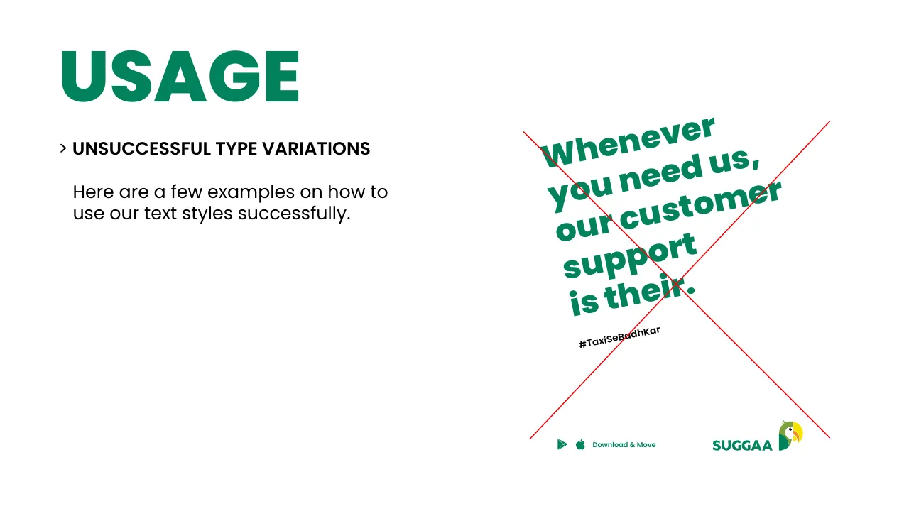
✕ Don’tDon’t rotate headlines
Usage example 69
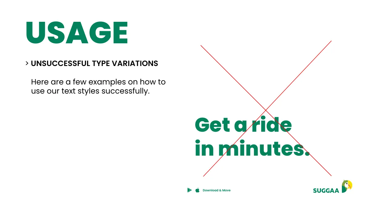
✕ Don’tDon’t let text crash into the edge or the visual
09 · Icons

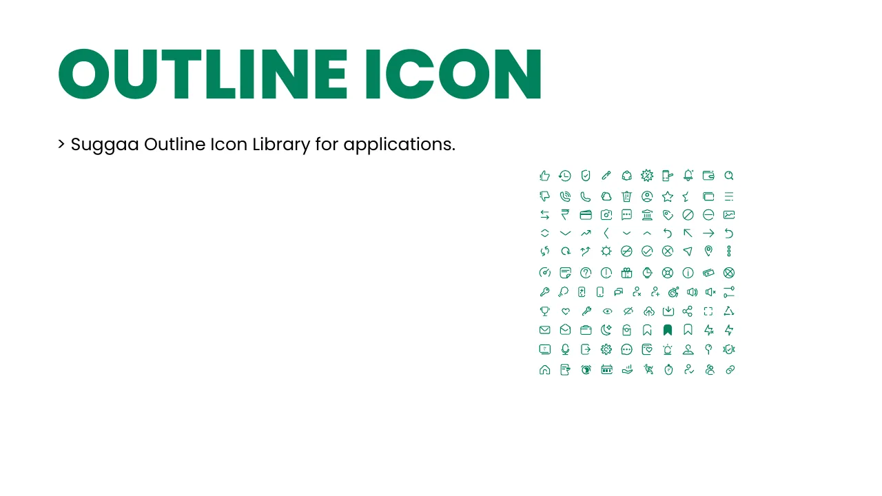
A friendly icon set, built on a grid

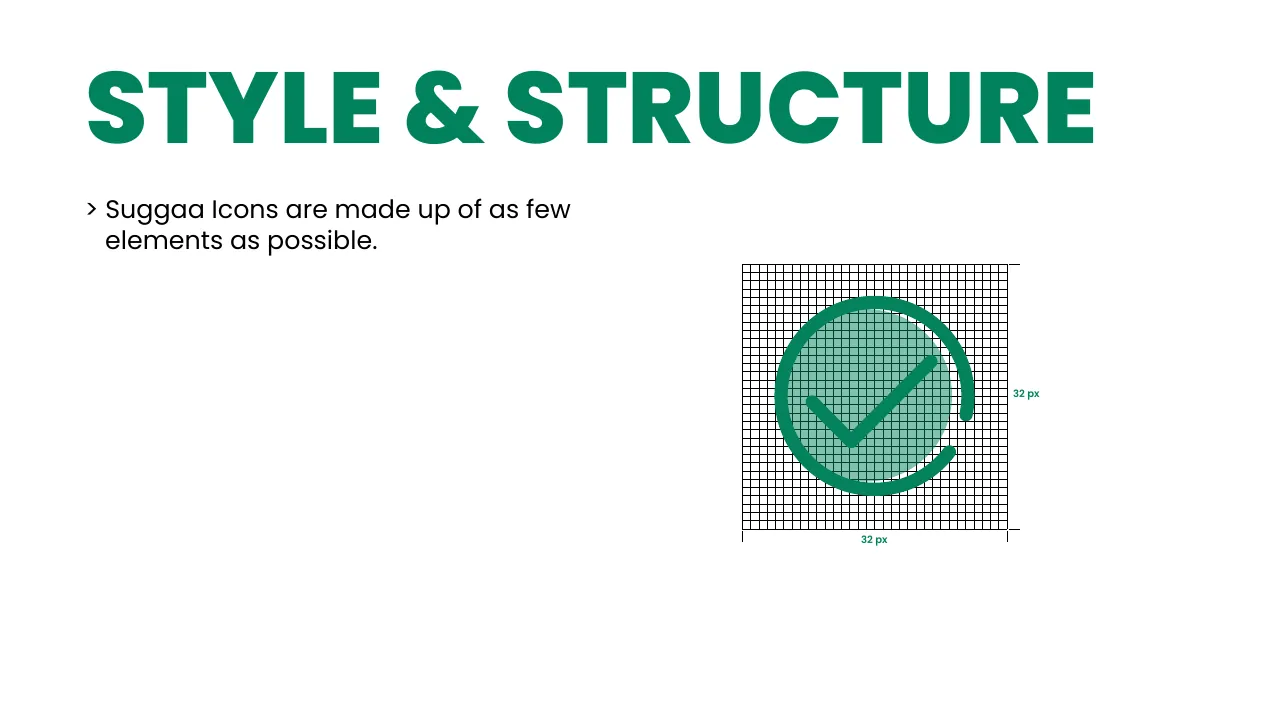
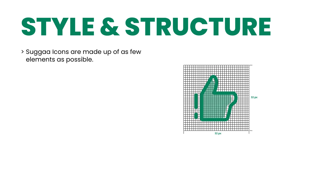
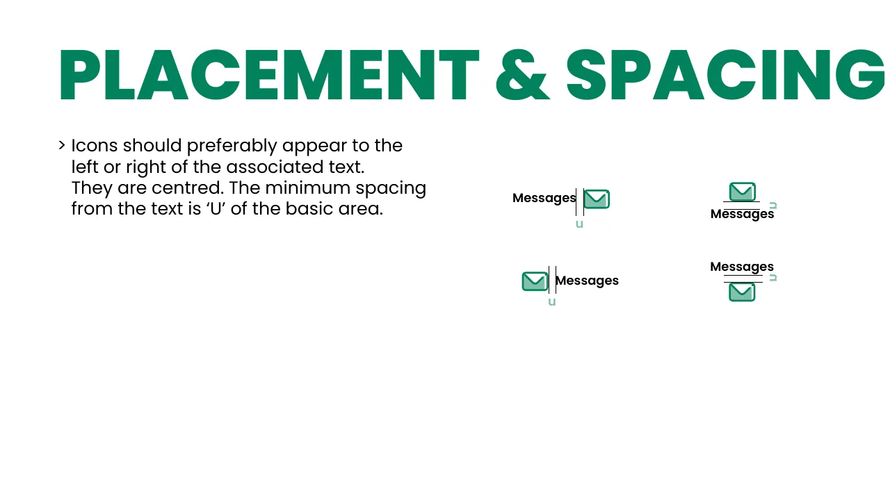
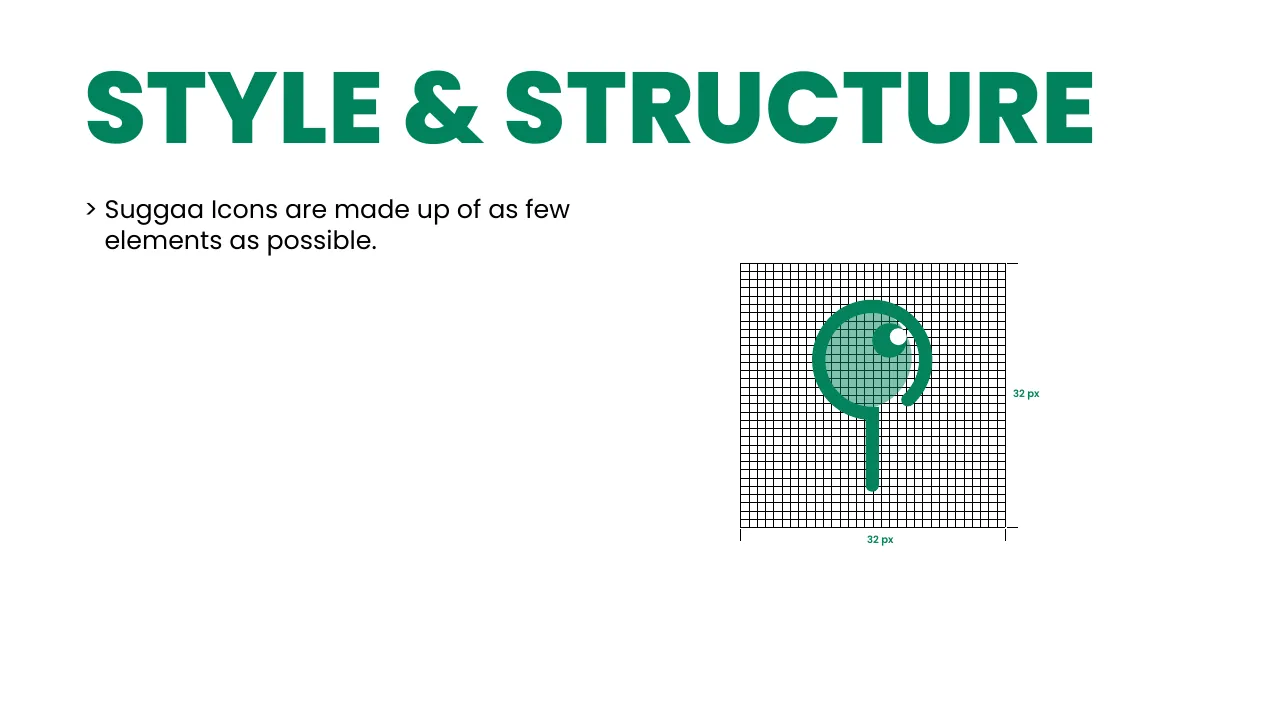
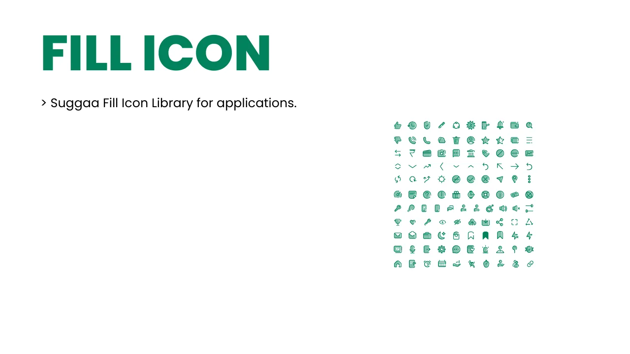
Fill and outline icons share one grid and as few shapes as possible. Next to text they sit left or right, centred, with one “U” of space.
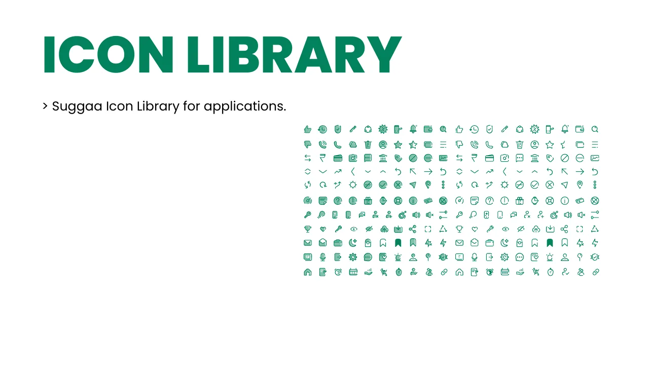
Icon library
Icon library
Fill icons
Fill icons
Outline icons
Outline icons
Icon style & structure
Icon placement & spacing
10 · Illustration

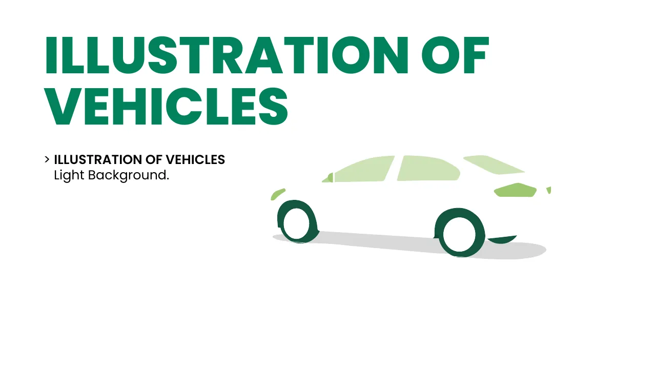
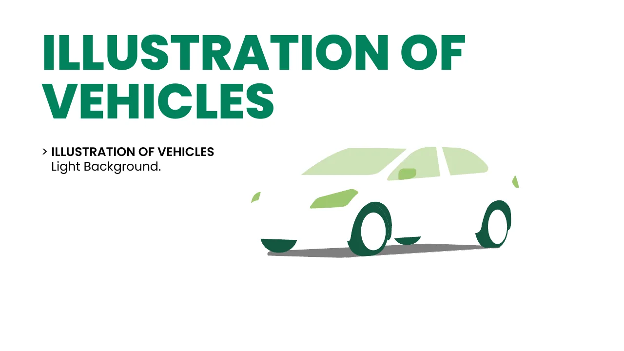
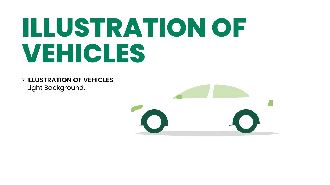
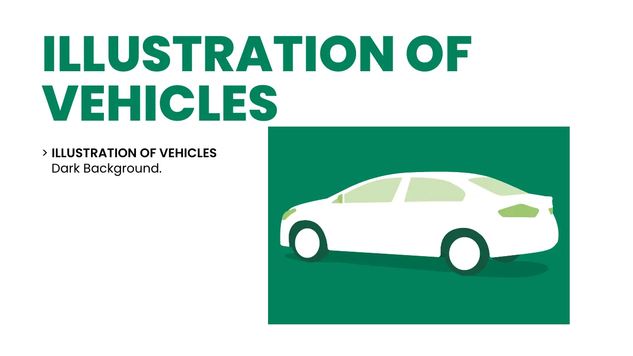
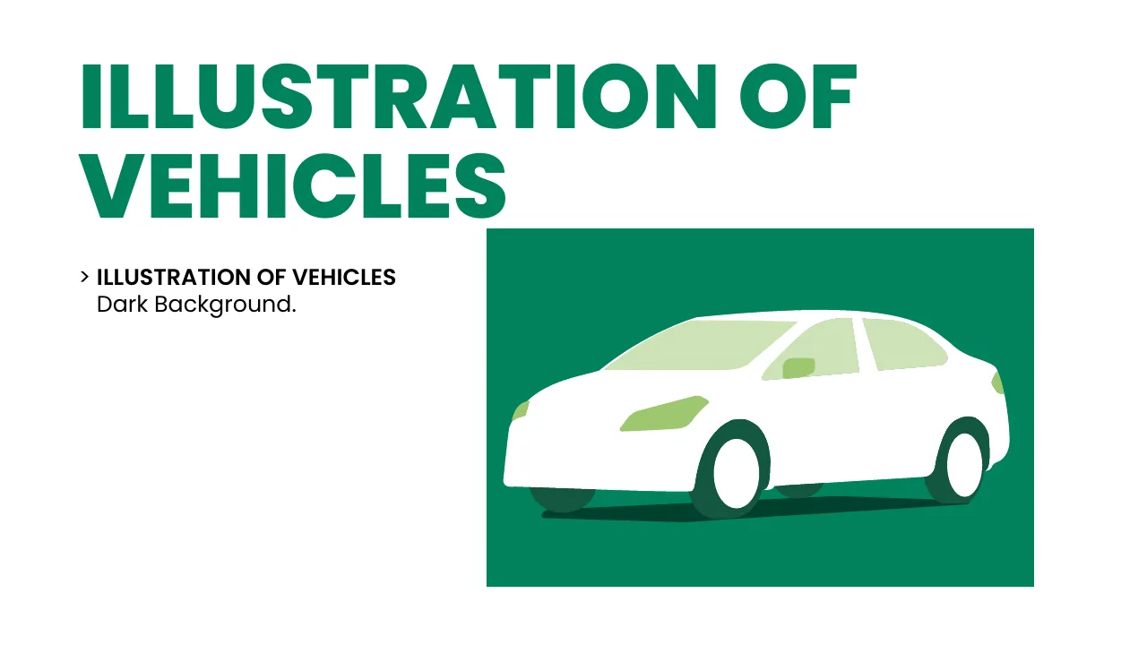
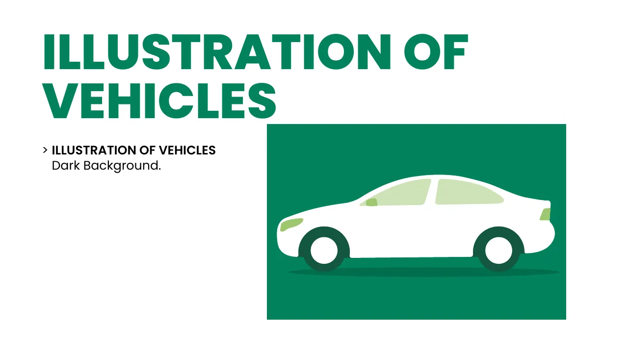
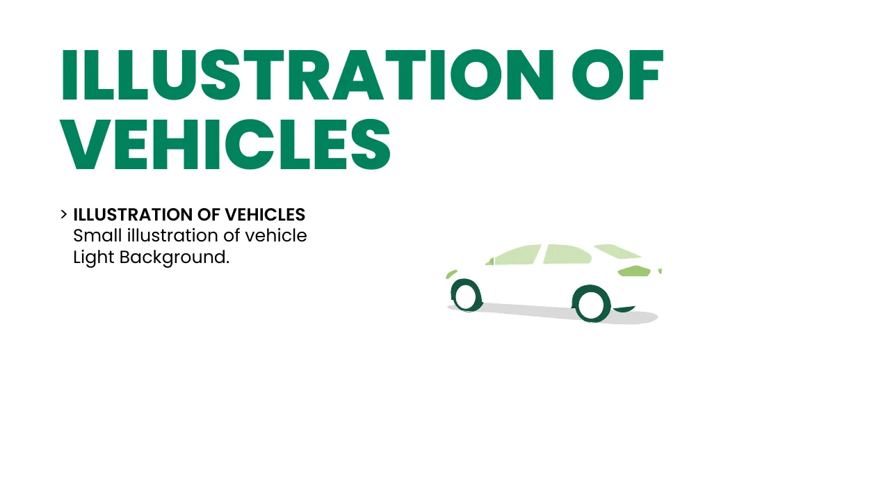
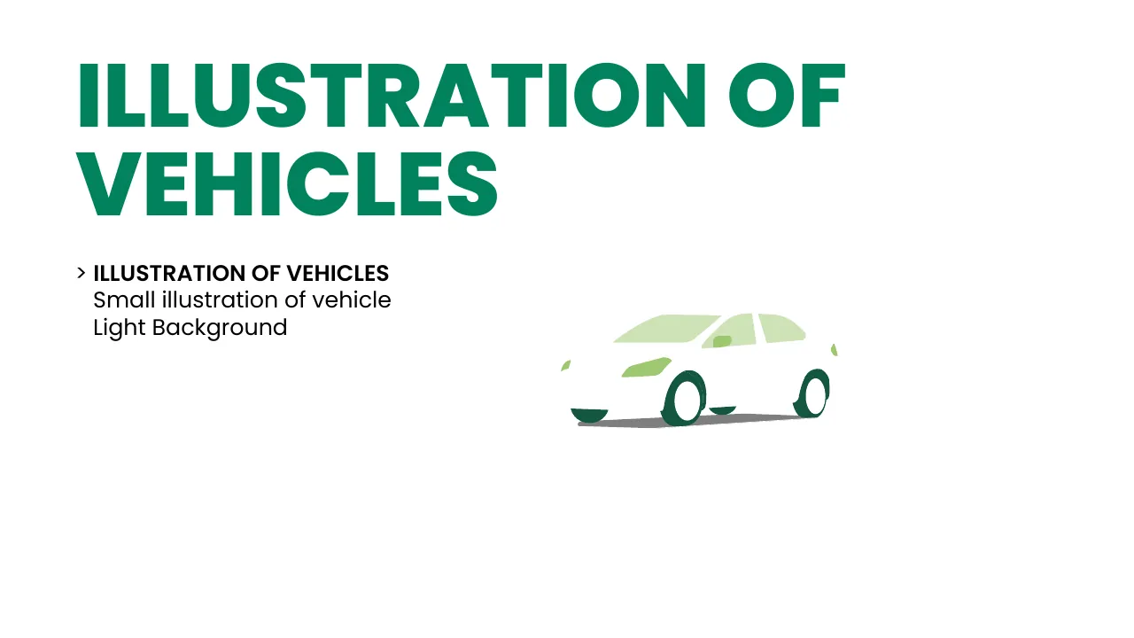
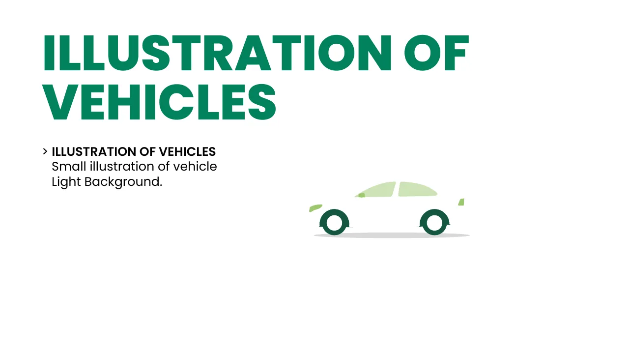
Cars drawn in brand greens

Suggaa vehicle illustration, page 80
Suggaa vehicle illustration, page 81
Suggaa vehicle illustration, page 82
Suggaa vehicle illustration, page 83
Suggaa vehicle illustration, page 84
Suggaa vehicle illustration, page 85
Suggaa vehicle illustration, page 86
Suggaa vehicle illustration, page 87
Suggaa vehicle illustration, page 88
Suggaa vehicle illustration, page 89
Suggaa vehicle illustration, page 90
Suggaa vehicle illustration, page 91
Suggaa vehicle illustration, page 92
Suggaa vehicle illustration, page 93
Suggaa vehicle illustration, page 80
Suggaa vehicle illustration, page 81
Suggaa vehicle illustration, page 82
Suggaa vehicle illustration, page 83
Suggaa vehicle illustration, page 84
Suggaa vehicle illustration, page 85
Suggaa vehicle illustration, page 86
Suggaa vehicle illustration, page 87
Suggaa vehicle illustration, page 88
Suggaa vehicle illustration, page 89
Suggaa vehicle illustration, page 90
Suggaa vehicle illustration, page 91
Suggaa vehicle illustration, page 92
Suggaa vehicle illustration, page 93

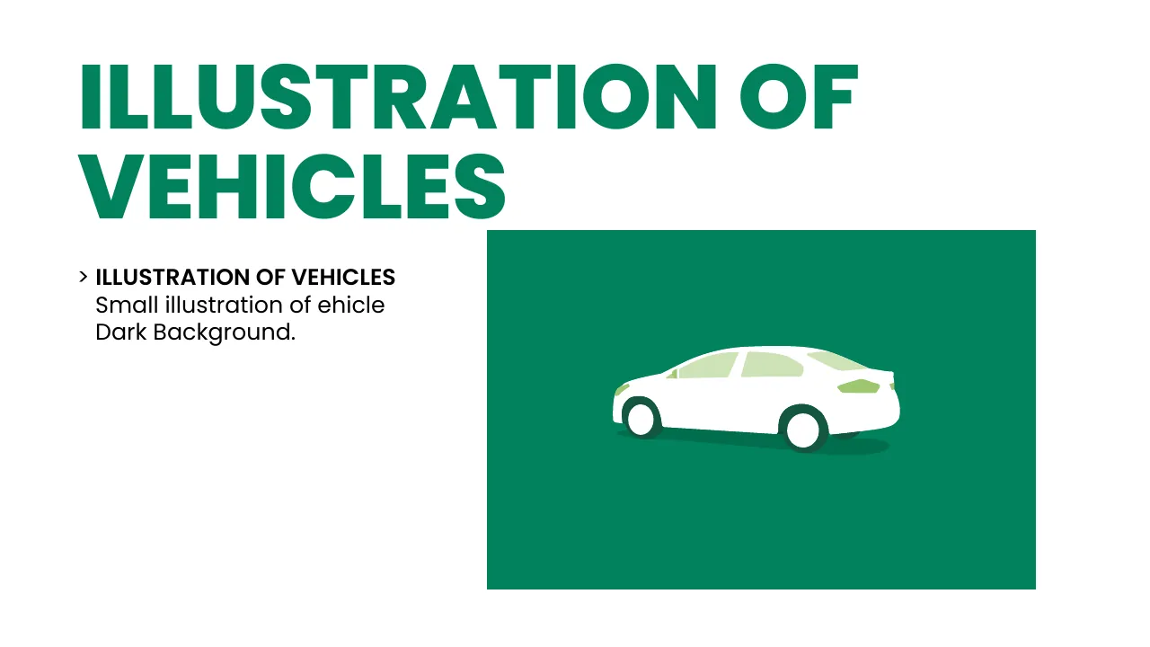
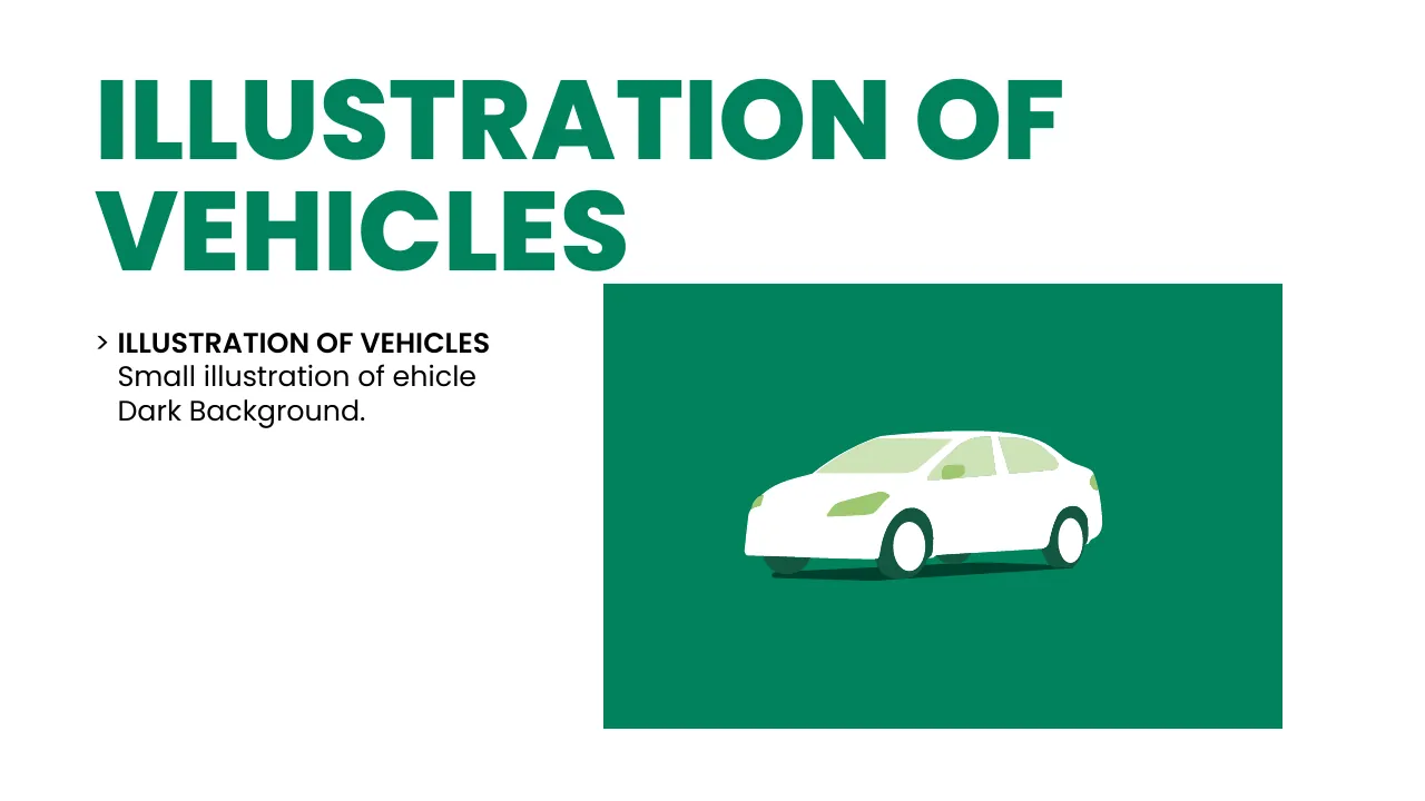
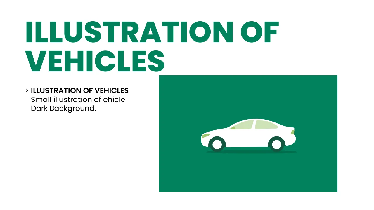
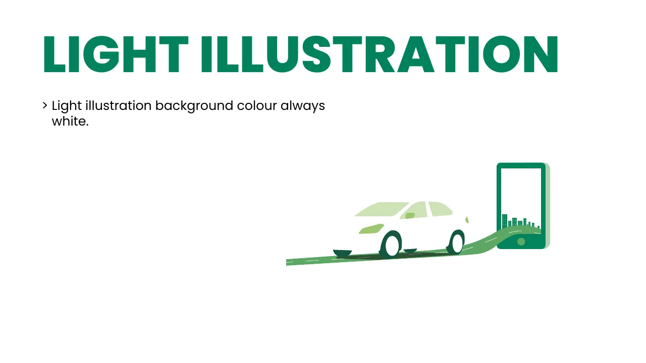
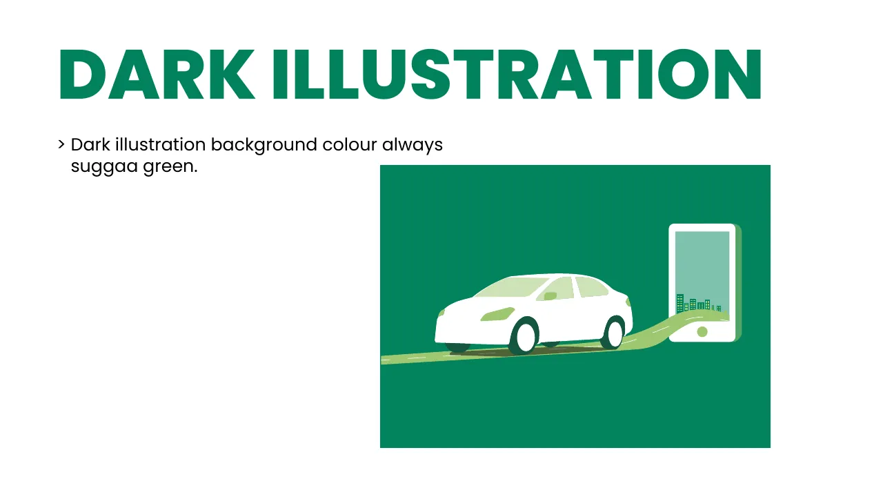
Light illustrations sit on white, dark illustrations on Suggaa Green. Vehicles are simple, flat and friendly — never realistic.

10b · Bike cab & fleet

Every ride, from every side

Fleet PDF ↓

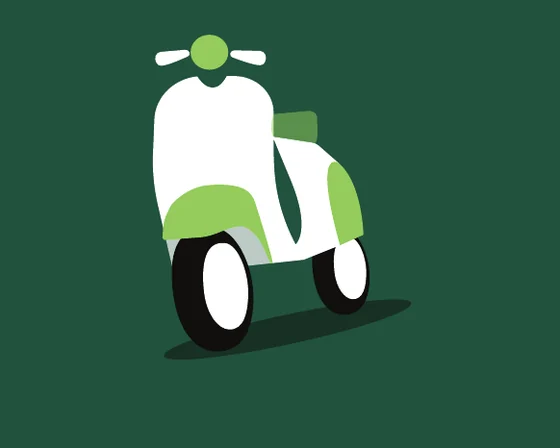
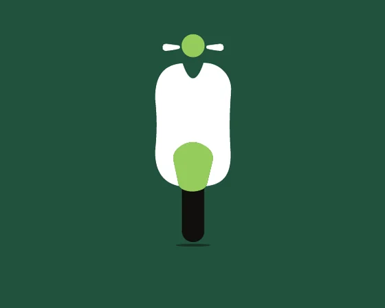
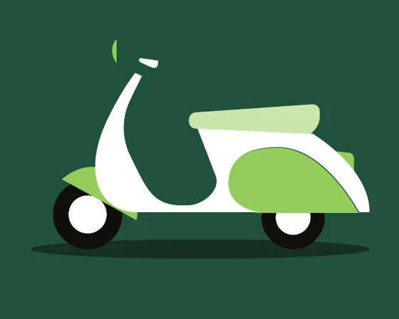
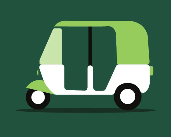
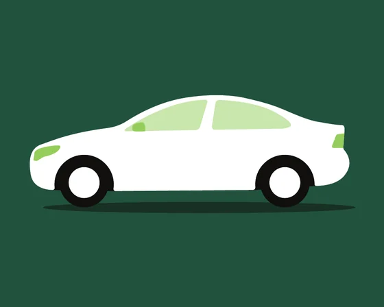
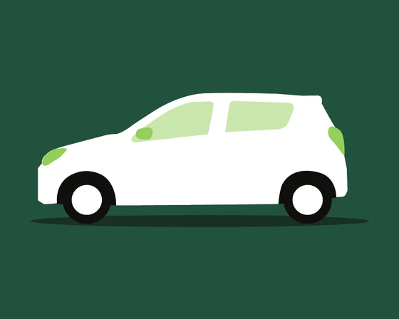
The newest set — Suggaa’s bike cab, auto, sedan and hatchback, each drawn from six angles in three colour treatments. Drag the stage (or let it spin) to walk around each vehicle.
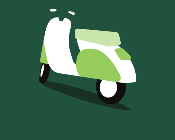
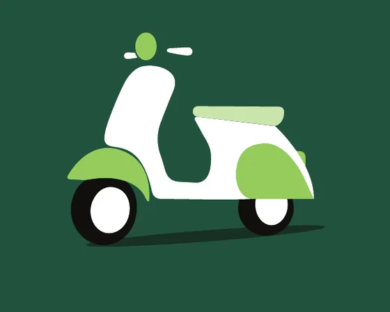
Suggaa bike cab illustration — Rear ¾ viewSuggaa bike cab illustration — Side viewSuggaa bike cab illustration — Front ¾ viewSuggaa bike cab illustration — Front viewSuggaa bike cab illustration — Profile viewSuggaa bike cab illustration — Rear view Bike cabRear ¾
11 · Motion

How Suggaa moves

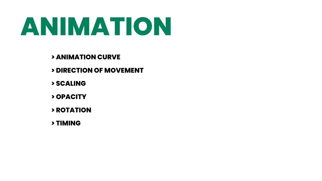
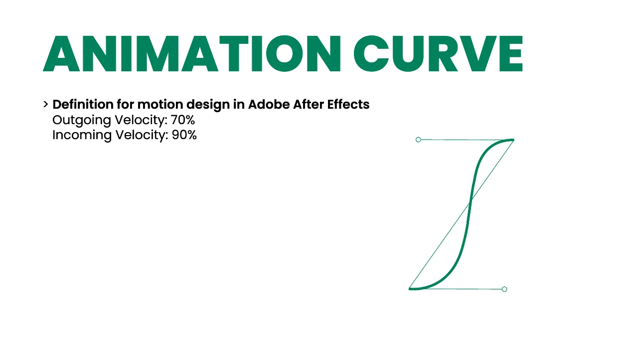
Six rules from the guide, playing live. In After Effects the curve is 70% outgoing / 90% incoming velocity — on the web that’s cubic-bezier(.7, 0, .1, 1).

Animation curve

Starts slow, rushes, then glides in. Never linear.

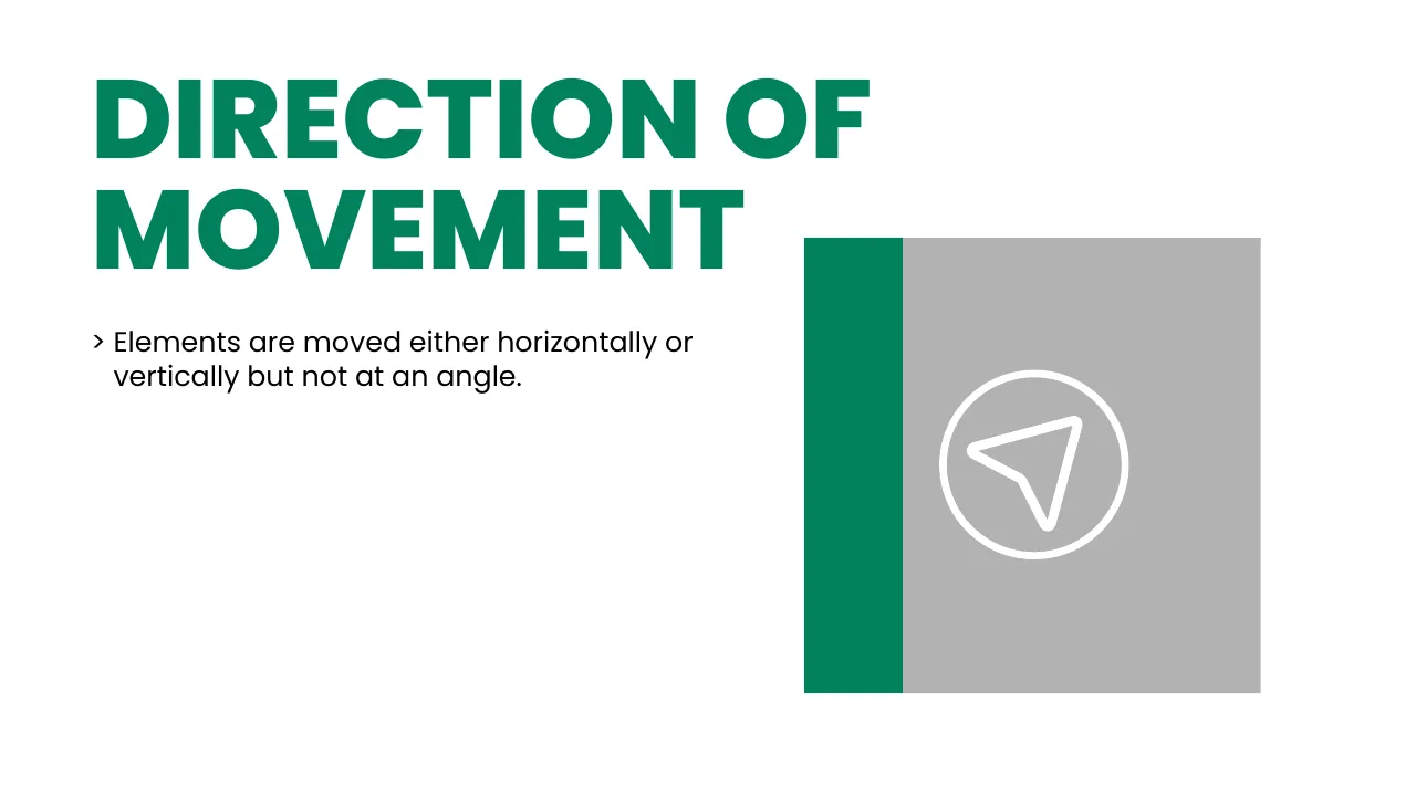
Direction

Move horizontally or vertically — never at an angle.

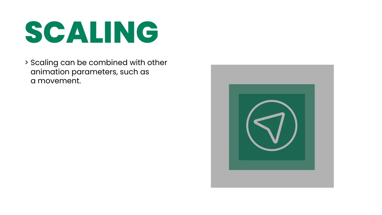
Scaling

Scaling can be combined with movement.

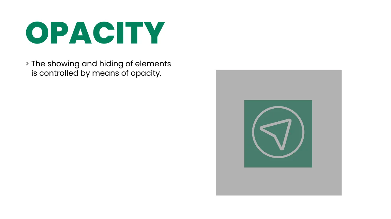
Opacity

Show and hide elements with opacity.

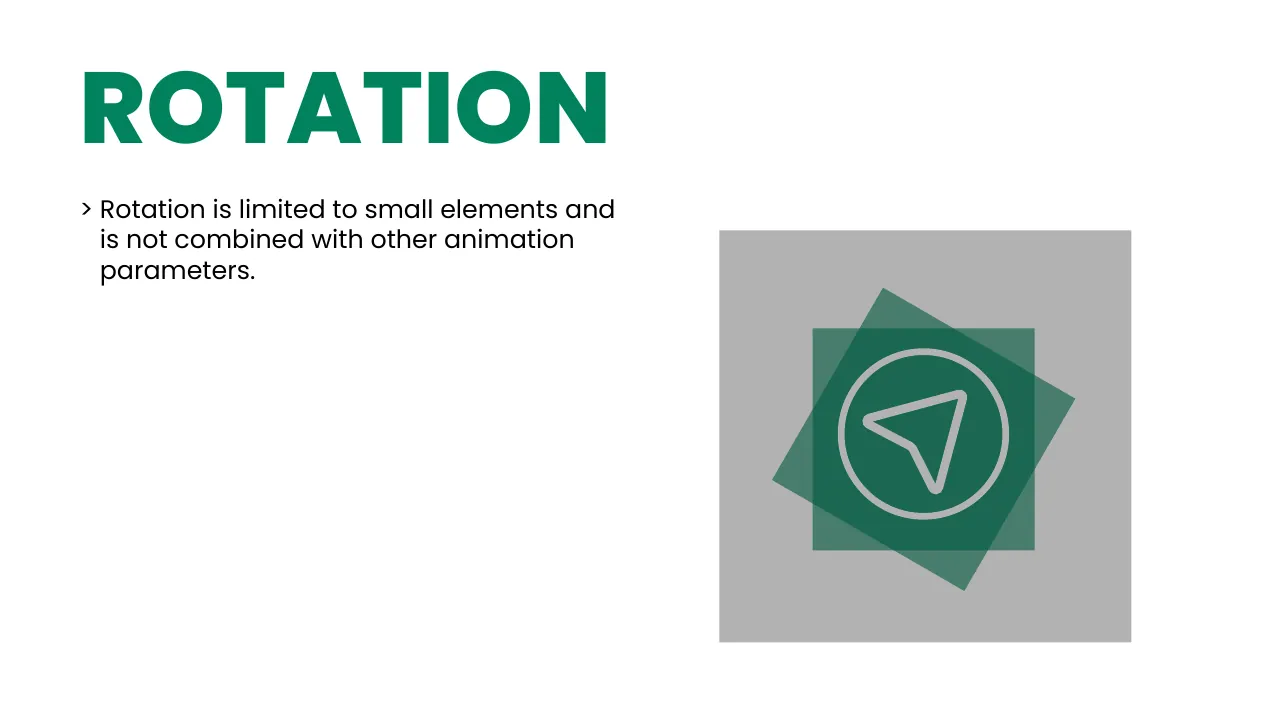
Rotation

Only for small elements — and never combined with other moves.

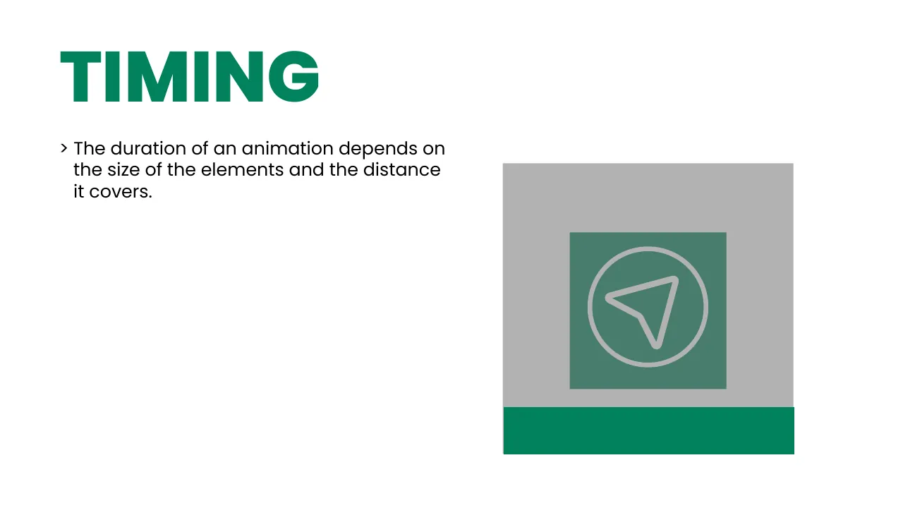
Timing

Bigger elements and longer distances take more time.
12 · The full guide

All 99 pages, flip through

Download PDF ↓
Suggaa brand guidelines page 1: Cover
01 Cover
Suggaa brand guidelines page 2: Brand identity guidelines
02 Brand identity guidelines
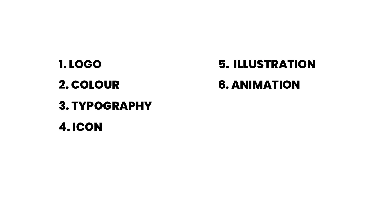
Suggaa brand guidelines page 3: Contents
03 Contents
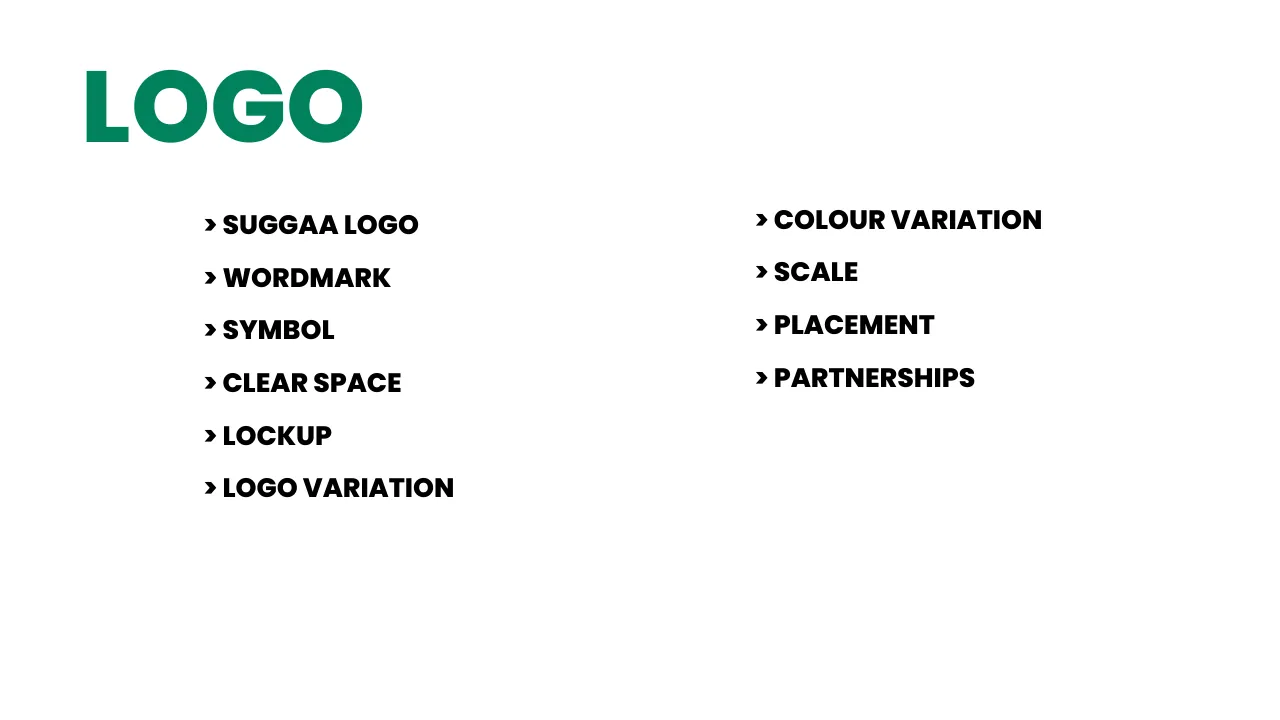
Suggaa brand guidelines page 4: Logo
04 Logo
Suggaa brand guidelines page 5: Colour
05 Colour
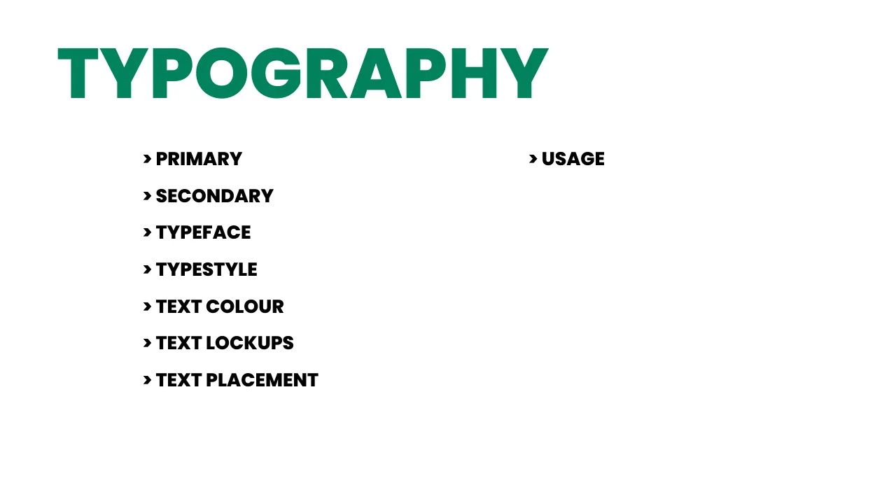
Suggaa brand guidelines page 6: Typography
06 Typography
Suggaa brand guidelines page 7: Icon
07 Icon
Suggaa brand guidelines page 8: Illustration
08 Illustration
Suggaa brand guidelines page 9: Animation
09 Animation
Suggaa brand guidelines page 10: Suggaa logo
10 Suggaa logo
Suggaa brand guidelines page 11: Wordmark
11 Wordmark
Suggaa brand guidelines page 12: Symbol
12 Symbol
Suggaa brand guidelines page 13: Clear space
13 Clear space
Suggaa brand guidelines page 14: Clear space
14 Clear space
Suggaa brand guidelines page 15: Lockup
15 Lockup
Suggaa brand guidelines page 16: Lockup
16 Lockup
Suggaa brand guidelines page 17: Logo variation
17 Logo variation
Suggaa brand guidelines page 18: Logo variation
18 Logo variation
Suggaa brand guidelines page 19: Logo variation
19 Logo variation
Suggaa brand guidelines page 20: Logo variation
20 Logo variation
Suggaa brand guidelines page 21: Logo variation
21 Logo variation
Suggaa brand guidelines page 22: Colour variation
22 Colour variation
Suggaa brand guidelines page 23: Colour variation
23 Colour variation
Suggaa brand guidelines page 24: Colour variation
24 Colour variation
Suggaa brand guidelines page 25: Colour variation
25 Colour variation
Suggaa brand guidelines page 26: Colour variation
26 Colour variation
Suggaa brand guidelines page 27: Scale
27 Scale
Suggaa brand guidelines page 28: Scale
28 Scale
Suggaa brand guidelines page 29: Placement
29 Placement
Suggaa brand guidelines page 30: Placement
30 Placement
Suggaa brand guidelines page 31: Placement
31 Placement
Suggaa brand guidelines page 32: Placement
32 Placement
Suggaa brand guidelines page 33: Placement
33 Placement
Suggaa brand guidelines page 34: Placement
34 Placement
Suggaa brand guidelines page 35: Placement
35 Placement
Suggaa brand guidelines page 36: Placement
36 Placement
Suggaa brand guidelines page 37: Partnerships
37 Partnerships
Suggaa brand guidelines page 38: Partnerships
38 Partnerships
Suggaa brand guidelines page 39: Partnerships
39 Partnerships
Suggaa brand guidelines page 40: Partnerships
40 Partnerships
Suggaa brand guidelines page 41: Primary colour
41 Primary colour
Suggaa brand guidelines page 42: Secondary colour
42 Secondary colour
Suggaa brand guidelines page 43: Secondary colour
43 Secondary colour
Suggaa brand guidelines page 44: Colour rules
44 Colour rules
Suggaa brand guidelines page 45: Colour rules
45 Colour rules
Suggaa brand guidelines page 46: Colour rules
46 Colour rules
Suggaa brand guidelines page 47: Colour rules
47 Colour rules
Suggaa brand guidelines page 48: Colour rules
48 Colour rules
Suggaa brand guidelines page 49: Colour rules
49 Colour rules
Suggaa brand guidelines page 50: Background colour
50 Background colour
Suggaa brand guidelines page 51: Primary typeface
51 Primary typeface
Suggaa brand guidelines page 52: Secondary typeface
52 Secondary typeface
Suggaa brand guidelines page 53: Typeface
53 Typeface
Suggaa brand guidelines page 54: Typestyle
54 Typestyle
Suggaa brand guidelines page 55: Typestyle
55 Typestyle
Suggaa brand guidelines page 56: Text colour
56 Text colour
Suggaa brand guidelines page 57: Text lockups
57 Text lockups
Suggaa brand guidelines page 58: Text lockups
58 Text lockups
Suggaa brand guidelines page 59: Text lockups
59 Text lockups
Suggaa brand guidelines page 60: Text placement
60 Text placement
Suggaa brand guidelines page 61: Text placement
61 Text placement
Suggaa brand guidelines page 62: Text placement
62 Text placement
Suggaa brand guidelines page 63: Usage
63 Usage
Suggaa brand guidelines page 64: Usage
64 Usage
Suggaa brand guidelines page 65: Usage
65 Usage
Suggaa brand guidelines page 66: Usage
66 Usage
Suggaa brand guidelines page 67: Usage
67 Usage
Suggaa brand guidelines page 68: Usage
68 Usage
Suggaa brand guidelines page 69: Usage
69 Usage
Suggaa brand guidelines page 70: Icon library
70 Icon library
Suggaa brand guidelines page 71: Fill icons
71 Fill icons
Suggaa brand guidelines page 72: Outline icons
72 Outline icons
Suggaa brand guidelines page 73: Icon style & structure
73 Icon style & structure
Suggaa brand guidelines page 74: Icon style & structure
74 Icon style & structure
Suggaa brand guidelines page 75: Icon style & structure
75 Icon style & structure
Suggaa brand guidelines page 76: Icon placement & spacing
76 Icon placement & spacing
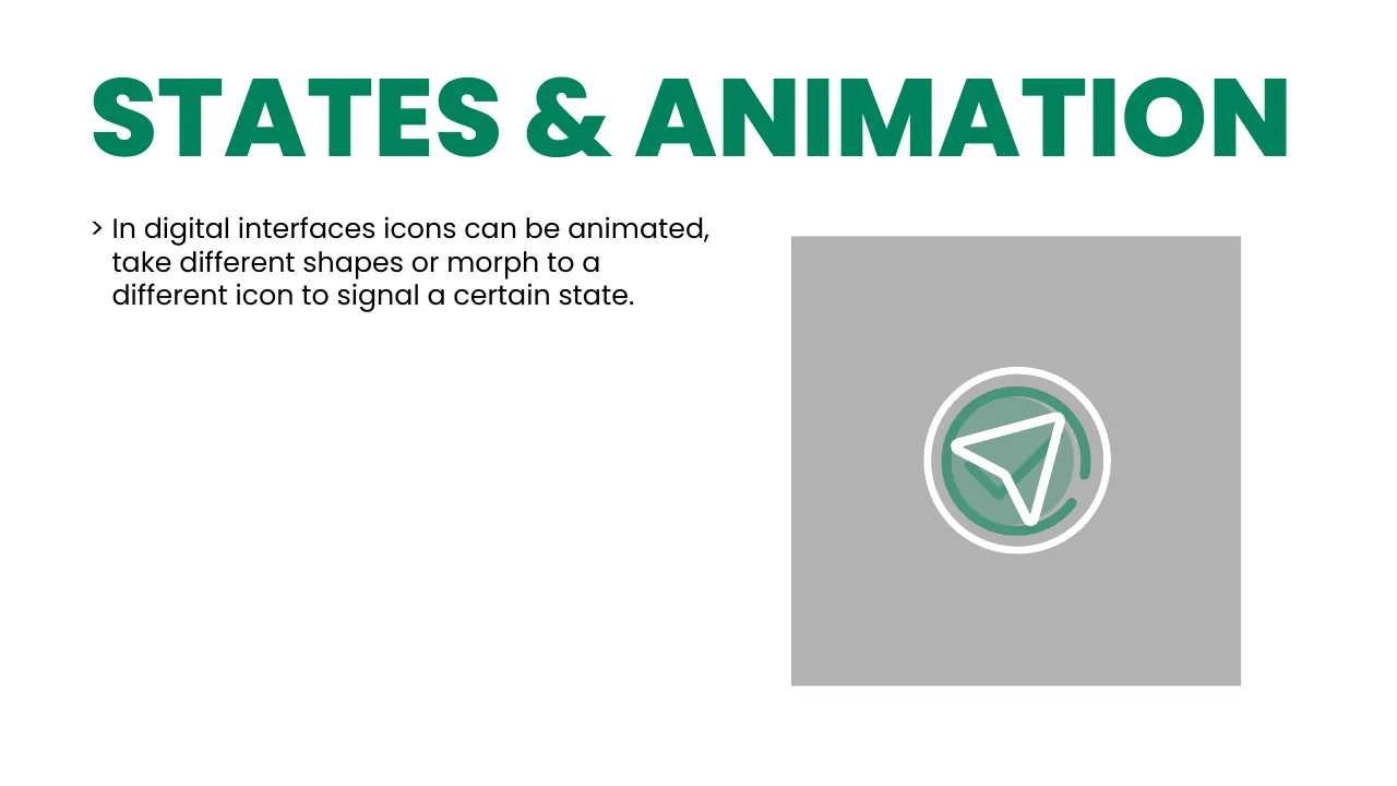
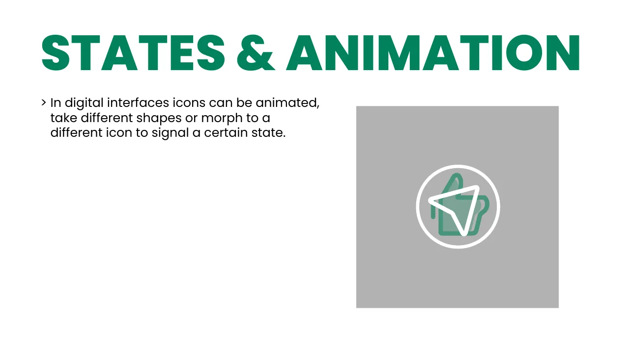
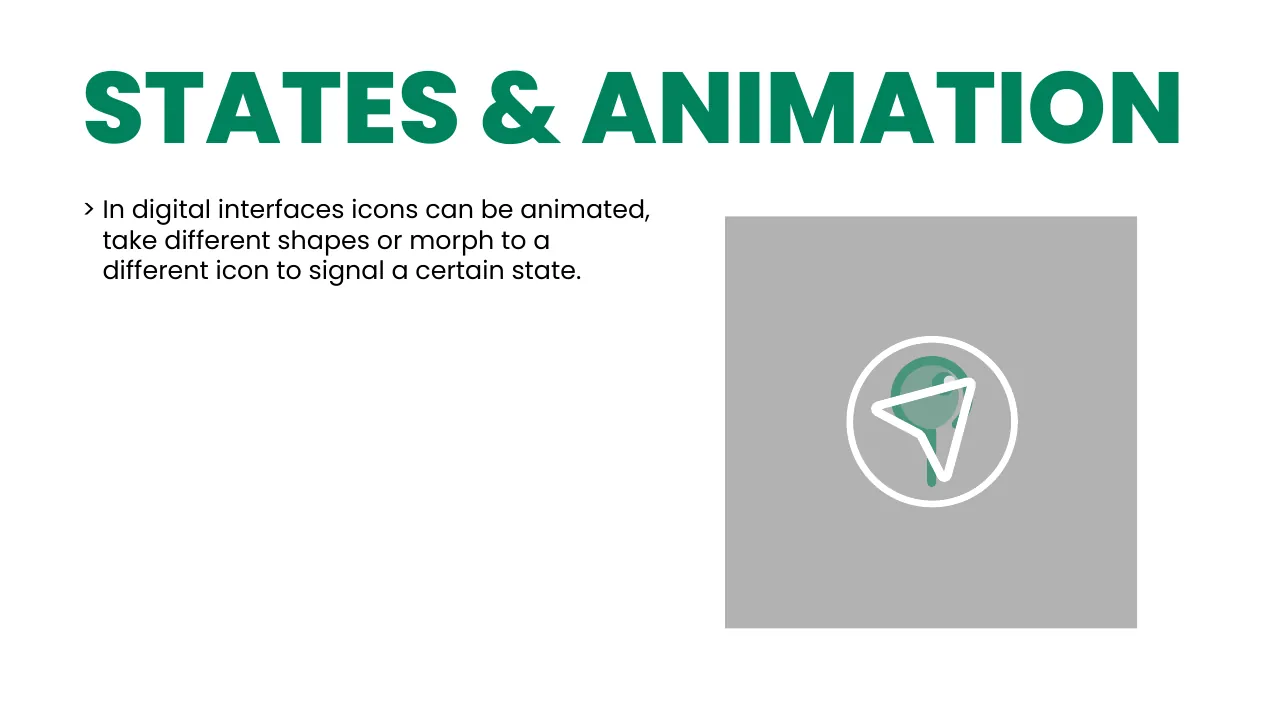
Suggaa brand guidelines page 77: Icon states & animation
77 Icon states & animation
Suggaa brand guidelines page 78: Icon states & animation
78 Icon states & animation
Suggaa brand guidelines page 79: Icon states & animation
79 Icon states & animation
Suggaa brand guidelines page 80: Illustration of vehicles
80 Illustration of vehicles
Suggaa brand guidelines page 81: Illustration of vehicles
81 Illustration of vehicles
Suggaa brand guidelines page 82: Illustration of vehicles
82 Illustration of vehicles
Suggaa brand guidelines page 83: Illustration of vehicles
83 Illustration of vehicles
Suggaa brand guidelines page 84: Illustration of vehicles
84 Illustration of vehicles
Suggaa brand guidelines page 85: Illustration of vehicles
85 Illustration of vehicles
Suggaa brand guidelines page 86: Illustration of vehicles
86 Illustration of vehicles
Suggaa brand guidelines page 87: Illustration of vehicles
87 Illustration of vehicles
Suggaa brand guidelines page 88: Illustration of vehicles
88 Illustration of vehicles
Suggaa brand guidelines page 89: Illustration of vehicles
89 Illustration of vehicles
Suggaa brand guidelines page 90: Illustration of vehicles
90 Illustration of vehicles
Suggaa brand guidelines page 91: Illustration of vehicles
91 Illustration of vehicles
Suggaa brand guidelines page 92: Light illustration
92 Light illustration
Suggaa brand guidelines page 93: Dark illustration
93 Dark illustration
Suggaa brand guidelines page 94: Animation curve
94 Animation curve
Suggaa brand guidelines page 95: Direction of movement
95 Direction of movement
Suggaa brand guidelines page 96: Scaling
96 Scaling
Suggaa brand guidelines page 97: Opacity
97 Opacity
Suggaa brand guidelines page 98: Rotation
98 Rotation
Suggaa brand guidelines page 99: Timing
99 Timing
01 / 99
Want a brand like this?

Logo, guidelines & motion — done properly

I design identities that look great, scale everywhere and come with a guide your whole team can follow.

Available for new projects

Have an idea? Let's make it move.
Book a free call →Instant quote ₹AI brief ✦
Find me

Studio in Bengaluru

3rd Phase, Apparel Park, Obadenahalli Industrial Area,
Doddaballapura, Bengaluru, Karnataka 561203
Open 24 hoursWorks with clients worldwide IST
● Satish Kumar — Creative Studio