Look like a top agency
Modern, confident design with motion in every section — on brand, with the DigitalNgage orange.
DigitalNgage is a digital marketing and technology agency. Its old site was a single page that showed and hid sections with JavaScript. I rebuilt it as a 13-page, fully animated website with a page for every service, real client case studies, articles and a lead form that works — and it still runs on simple shared hosting.

DigitalNgage runs social media, ads, SEO and websites for its clients — and also builds e-commerce stores and custom CRM software. None of that showed on its own website.
All “pages” lived in one index.html and were shown or hidden with JavaScript. Every section shared one URL, so nothing could be shared or found on Google on its own.
Only six services in short cards, and no case studies — even though the team had built the KIO Organics store and the Metro CRM.
Stray characters after the closing PHP tag meant the form's reply was not valid JSON, and the email's Reply-To line took the visitor's input without checking it.
Static layout, emoji icons and no motion — the site didn't match the quality of the work.
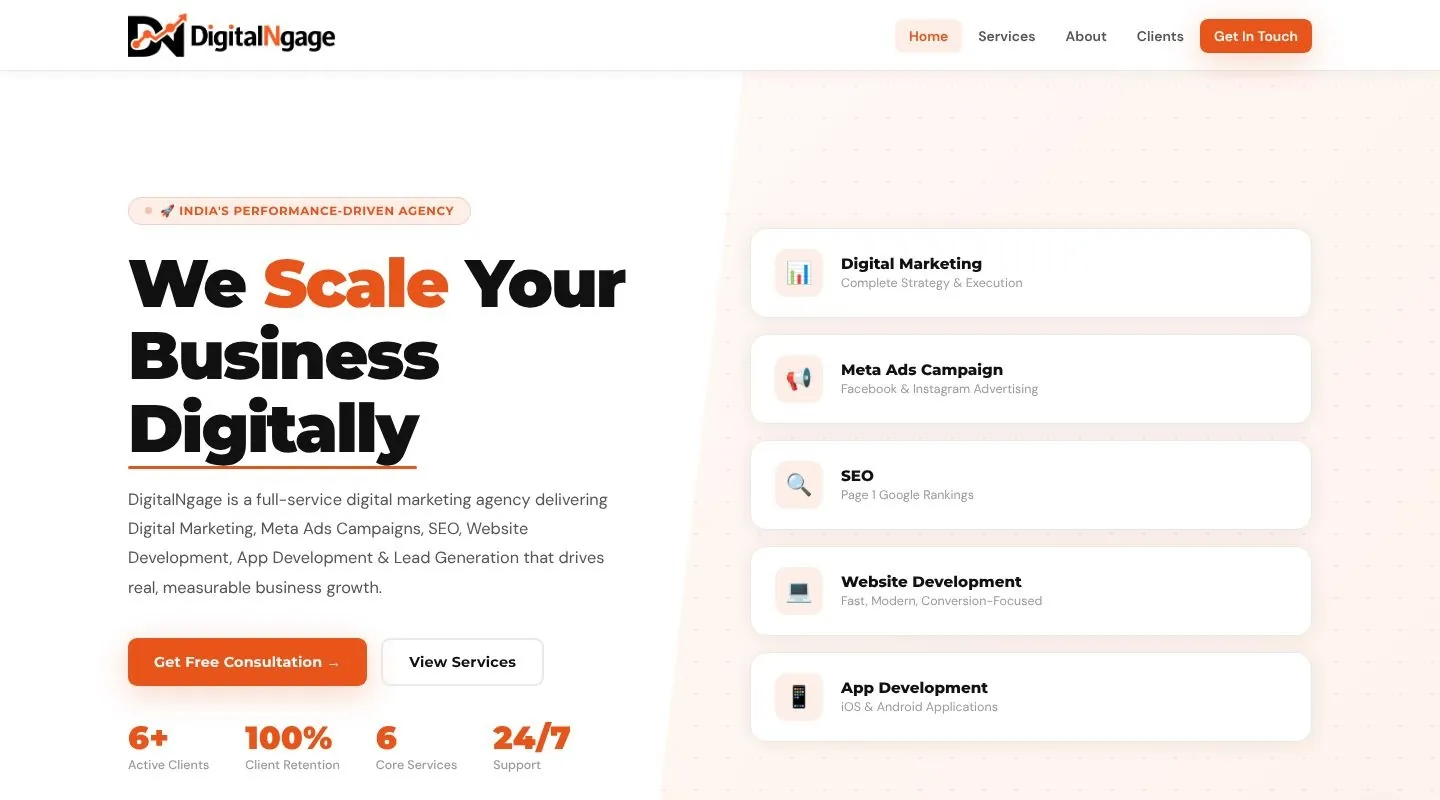
The previous site: one page, six services, no case studies.
“Latest, dynamic, fully animated — animation in every section. It should feel like a top digital marketing agency, with every page a marketing website needs.”
— DigitalNgage, in the project briefModern, confident design with motion in every section — on brand, with the DigitalNgage orange.
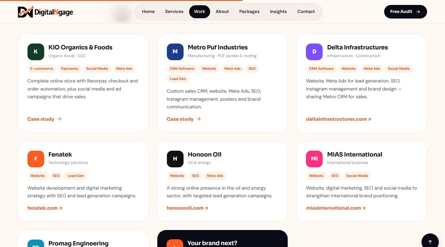
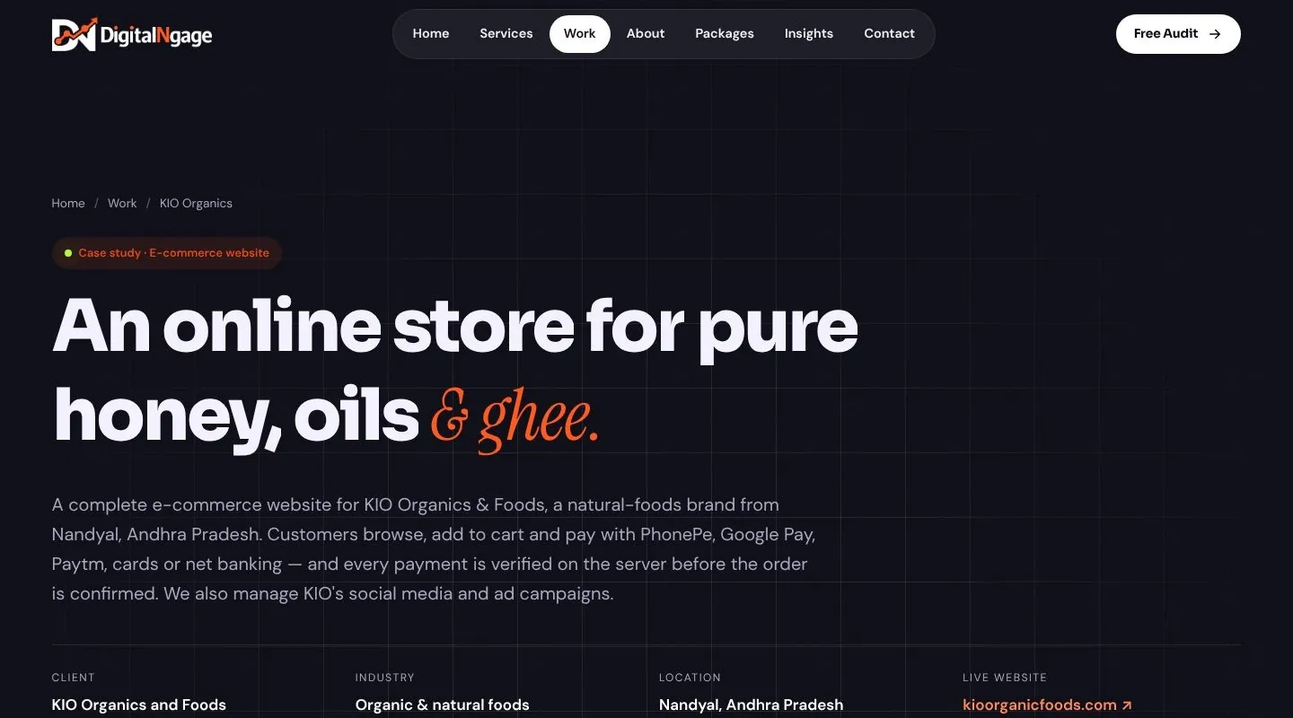
Full case studies for the KIO Organics e-commerce store and the Metro CRM software, built from the original project write-ups.
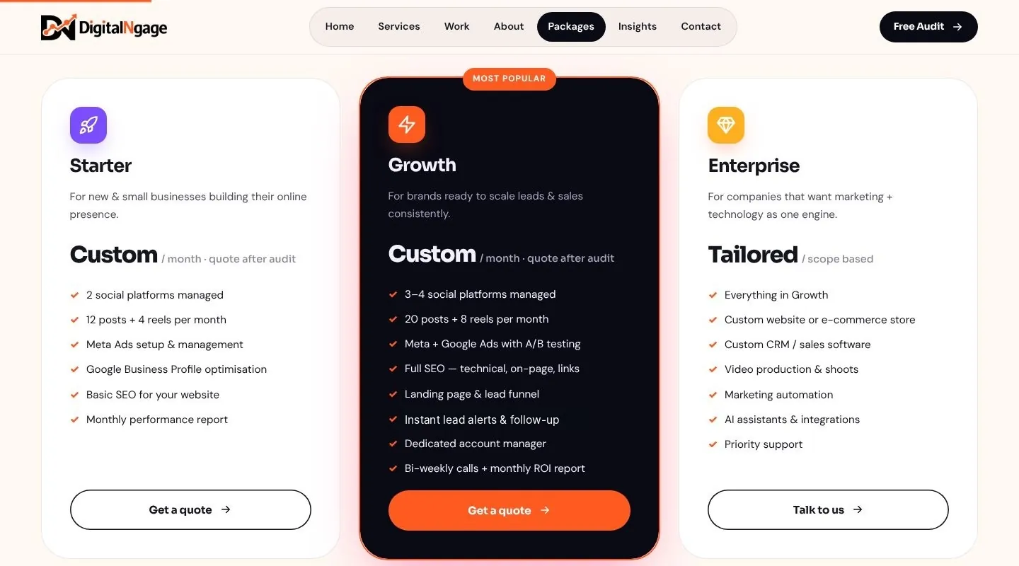
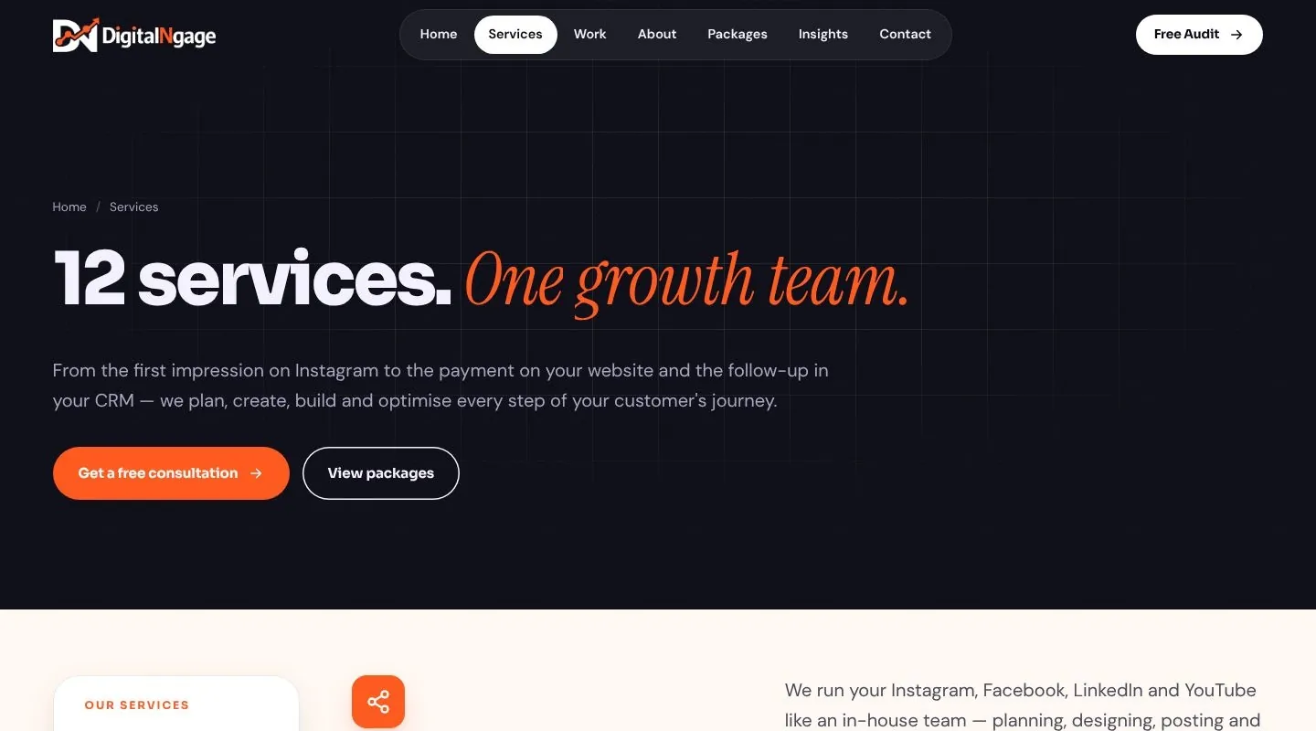
Services, portfolio, about, packages, insights, contact and FAQs — as separate, shareable pages.
The palette starts from the orange in the DigitalNgage mark, set against a deep ink and a warm paper white. Dark and light sections alternate down every page, so long pages never feel flat. The client preferred flat brand colours, so there are no gradients.

The DN mark is also the site's favicon and home-screen icon.
From the first headline to the footer, every section answers one question a prospect has: what do you do, who for, how, and why you.
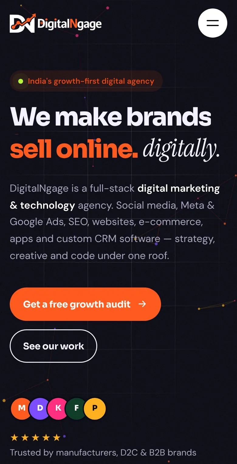
“We make brands go viral / sell online / rank #1 / get leads / scale fast — digitally.” The rotating phrase sits over an interactive network of connected dots — a nod to the graph line in the DN logo. Floating cards show real numbers, and a ticker lists every service.
Each card has its own icon, a short promise and tags. A soft highlight follows the cursor, the icon tilts on hover, and the whole card links to that service on the Services page.
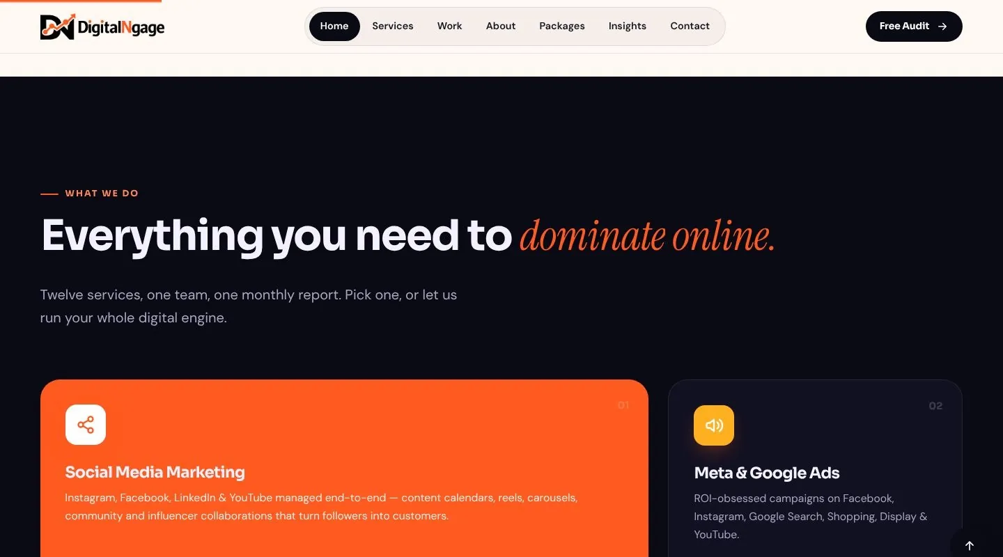
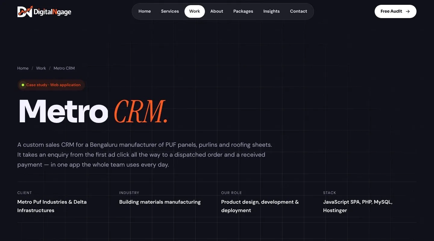
KIO Organics and Metro CRM appear as large cards that stick and stack as you scroll; the one underneath gently shrinks back. Each shows three hard numbers — 8 payment options, 6,000+ leads, 27,000+ follow-up notes.
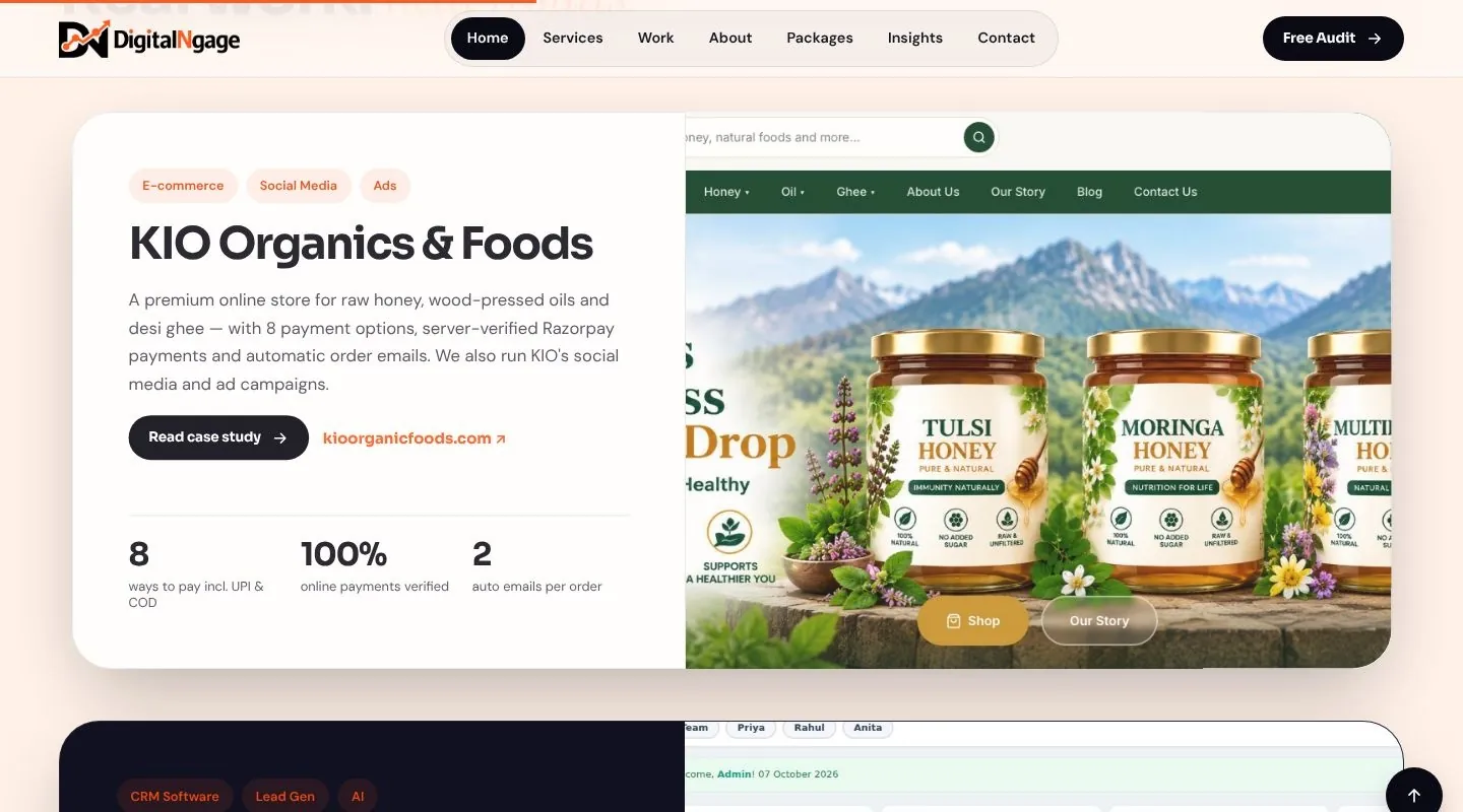
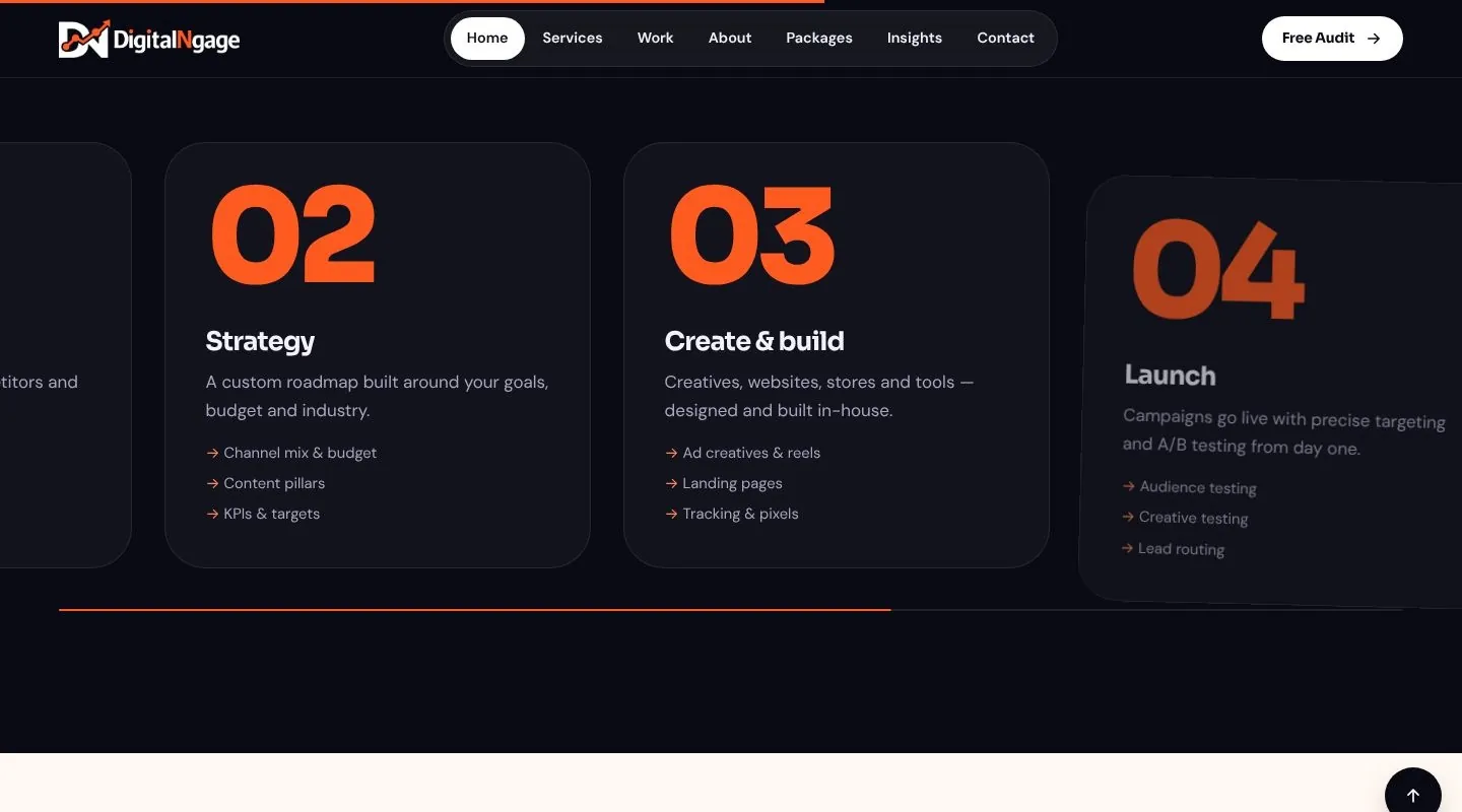
The section pins in place and the five steps — audit, strategy, create, launch, scale — slide past horizontally as you scroll down, with a progress line underneath. On phones it becomes a simple vertical list.
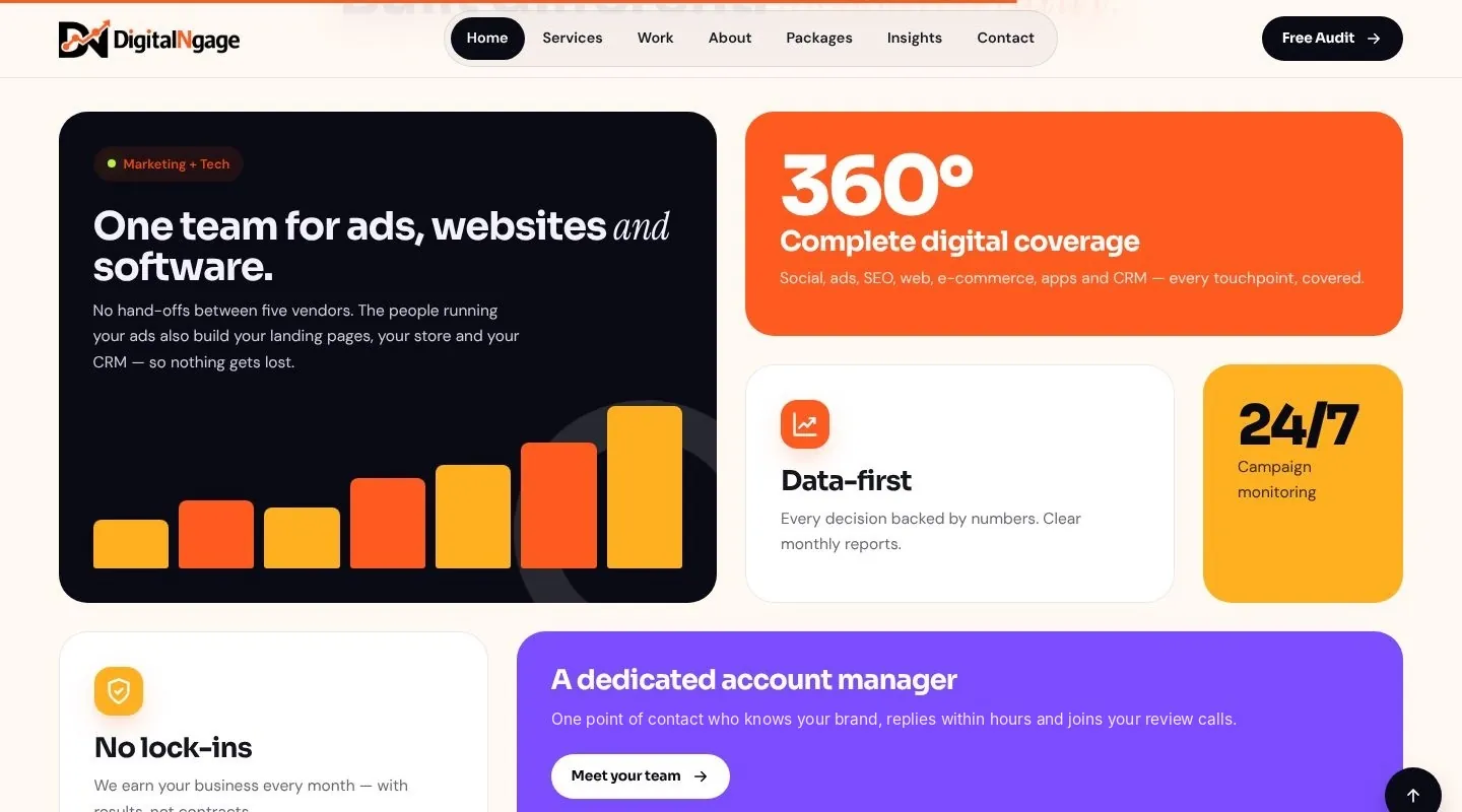
Marketing plus technology in one team, 360° coverage, data-first reporting, 24/7 monitoring, no lock-ins and a dedicated account manager — with bars that grow as the section comes into view.
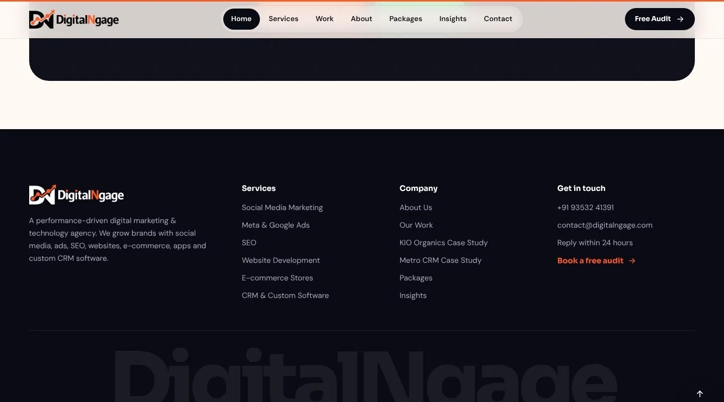
An auto-playing testimonial slider, six FAQs that open one at a time, a call-to-action block and a footer with every service and case study, ending in a giant DigitalNgage wordmark.
Motion is built with GSAP and ScrollTrigger, with Lenis for smooth scrolling. All three libraries are bundled with the site, so nothing depends on an outside CDN.
Every heading rises into place one word at a time as it enters the screen.
A canvas of connected dots in the hero drifts and moves away from the cursor — and pauses when off screen.
Buttons lean towards the pointer; a custom cursor grows over links and shows “View” or “Read” on cards.
Stats count up from zero when they scroll into view, formatted the Indian way (6,000+).
Case study cards pin and stack; images move slightly slower than the page for depth.
The process section scrolls horizontally, and marquees lean with the speed of your scroll.
A short loading screen shows only on the first visit, pages open with a single animation, and visitors who turn on “reduce motion” on their device get a calm, fully static version of every page. If JavaScript is off, all content is still visible.
Services, Work, About, Packages, Insights and Contact — plus two full case studies and a custom 404 page.
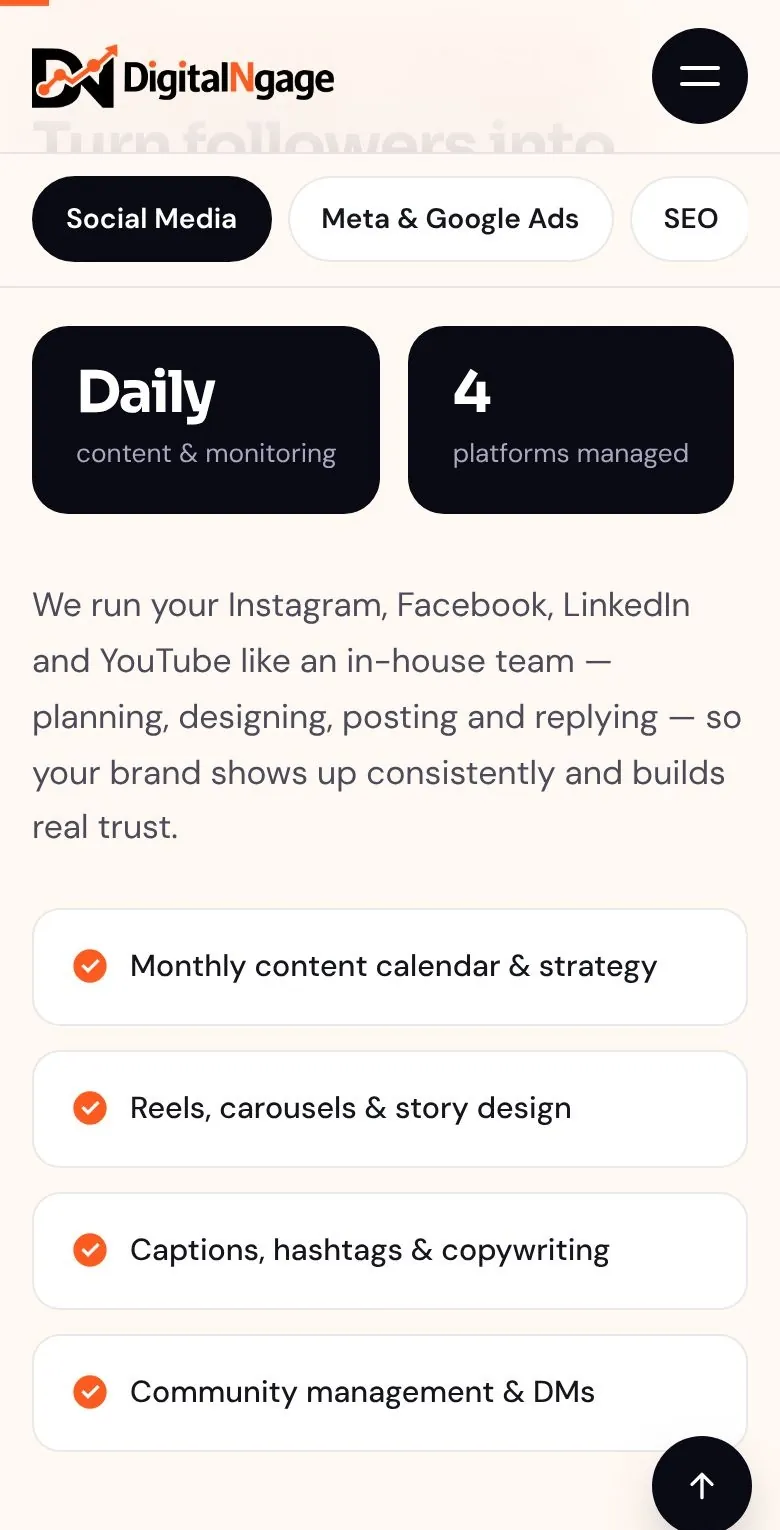
Every page was checked at phone width with no sideways scrolling. A full-screen menu opens from the corner, the services sidebar becomes a swipeable chip bar, and the process section turns into a simple vertical list.
After the first version went live, the client reviewed it on their own screen. Each round of feedback was turned around and re-checked on desktop and mobile.
Replaced every gradient and glow with solid brand orange, amber and violet on solid ink and paper.
Removed the fixed-width column so content spans the full screen, with a small comfortable margin.
Removed the page-change curtain; each page now opens with a single entrance animation.
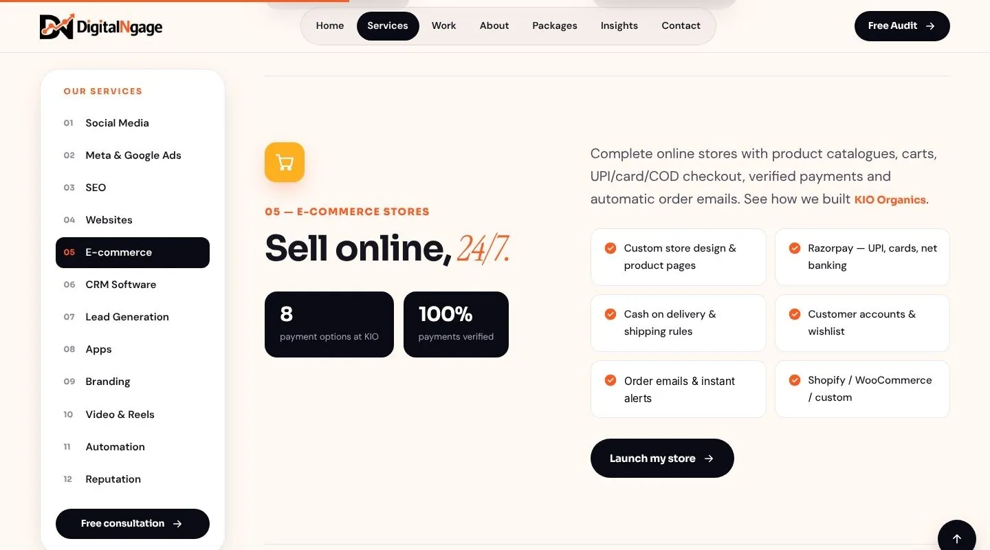
Moved the 12 services into a sticky left sidebar with numbers and a consultation button.
Built a three-column reading layout: contents list, a wider article and a sidebar with a CTA and related posts.
Turned the DN mark into a transparent favicon in every size, plus a home-screen icon.
The client hosts on standard shared hosting, so the site is plain HTML, CSS and JavaScript with one small PHP file — no Node server, no monthly platform fee.